Have you ever walked into a room and immediately felt calmer because of the colors and textures around you?
Why Japandi is often linked to mindfulness in color and texture
Japandi combines the restrained elegance of Japanese design with the cozy functionality of Scandinavian style, creating spaces that feel thoughtfully composed and soothing. You’ll find that color and texture are central to its ability to support mindful living — they guide your attention, anchor your senses, and shape the mood of a room without needing excess decoration.
What Japandi is and why color and texture matter
Japandi is a design fusion that prioritizes simplicity, craftsmanship, and utility, informed by Japanese wabi-sabi and Scandinavian minimalism. When you choose a Japandi palette and tactile scheme, you’re choosing elements that reduce visual noise and encourage presence through subtle contrasts and calming tones.
The practical effect of color and texture on mindfulness
Color and texture influence heart rate, focus, and emotional states. In Japandi interiors, muted colors and natural textures reduce sensory overload and invite you to slow down, notice small details, and appreciate the materials and shapes you live with.
Origins of Japandi: philosophical roots that shape visual choices
To understand why color and texture are so intentional in Japandi, you should know the philosophies behind it. Japanese aesthetics emphasize imperfection, restraint, and natural cycles, while Scandinavian design emphasizes functionality, light, and warmth.
Japanese aesthetic principles
Japanese aesthetics value wabi-sabi (finding beauty in imperfection and transience), ma (positive space and pause), and shinrin-yoku-like reverence for nature. These concepts encourage you to focus on subtle hues, quiet textures, and craftsmanship that reveals the material’s history.
Scandinavian design principles
Scandinavian design, including the idea of hygge (comfort and coziness), emphasizes light, clean forms, and tactile warmth. You’ll notice pale woods, soft textiles, and purposeful furniture that invites you to sit, rest, and slow your pace.
How the fusion creates mindful design choices
When you combine these influences, color palettes tend to be muted and tonal, while textures are natural and layered. Together they guide your attention to the essentials — function, form, and sensory comfort — instead of distracting ornament.
Color in Japandi: muted, tonal, and nature-inspired
Color in Japandi supports tranquility and focus. You’ll find restrained palettes that emphasize harmony rather than contrast.
Primary palette characteristics
Japandi palettes are typically neutral, earthy, and subdued. Think soft beiges, warm greys, muted greens, faded blues, and matte blacks. These colors create a calming backdrop and allow texture and shape to become the focal points.
The role of neutral tones
Neutral tones anchor the space and reduce visual competition. You’ll appreciate how a neutral wall or floor makes furniture and textiles feel intentional, not cluttered, which supports mindful awareness of your surroundings.
Accent colors: subtle, purposeful, and natural
Accents in Japandi are used sparingly — a moss green cushion, a deep indigo bowl, or a rust-colored throw. These choices reflect natural materials and seasonal shifts, encouraging you to notice small changes and to appreciate the present moment.
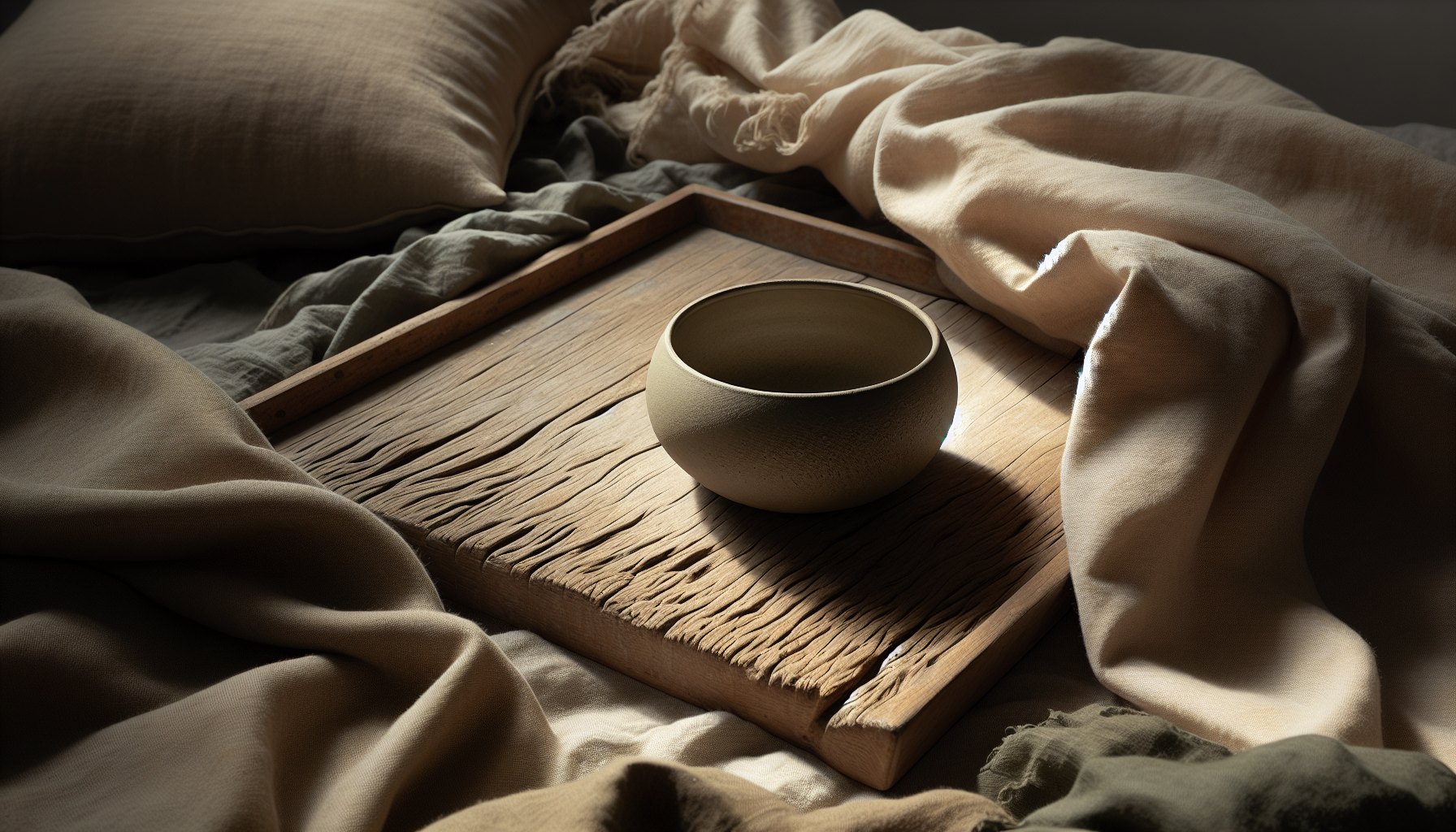
Texture in Japandi: natural, tactile, and honest
Texture is the language through which Japandi communicates warmth and authenticity. You’ll experience materials that age gracefully and invite touch.
Natural materials and tactile richness
Wood, linen, cotton, wool, ceramic, stone, and untreated metals are common. These materials carry textures that are tactile but not fussy, creating sensory variety without visual clutter.
Surface finishes and honesty of materials
Japandi celebrates the natural finish of materials: matte wood grains, hand-thrown ceramic ridges, and woven textile irregularities. You’ll find that these honest surfaces reduce the need for surface coverings and loud patterns.
Layering textures for calm contrast
Layering is subtle: a coarse jute rug under a smooth oak table, a soft wool throw over a linen sofa, or a rough ceramic vase on a polished shelf. These layers create quiet contrasts that engage touch and sight in a gentle, grounding way.
How color and texture support mindfulness in daily life
Japandi is not only an aesthetic but also a practice that makes mindful living easier. Your environment affects your habits, attention, and emotional regulation.
Visual simplicity encourages mental clarity
When your space has fewer competing colors and complex patterns, your brain has fewer stimuli to process. That reduction in visual noise makes it easier for you to focus, meditate, read, or simply be present with family and friends.
Tactile engagement grounds you in the present
Touching natural materials — the grain of a wooden table, the softness of a wool throw — triggers sensory feedback that helps anchor your awareness in the here and now. These tactile experiences provide small moments of mindfulness throughout the day.
Intention in every object reduces decision fatigue
You’ll find that Japandi encourages you to own fewer, better things. When every piece has purpose and place, decisions about what to wear, where to sit, or how to decorate become simpler, leaving more mental energy for meaningful tasks.
Color psychology: how Japandi tones affect mood
Understanding the emotional impact of color helps you apply Japandi principles with intention. The selected tones support calm, focus, and warmth.
Warm neutrals: comfort without heaviness
Colors like warm beiges, taupes, and light browns provide a sense of grounding and comfort without gloom. You’ll feel supported and relaxed in rooms painted in these hues.
Cool neutrals and muted blues: clarity and calm
Pale greys and muted blues reduce agitation and promote concentration. These tones work well in workspaces and bedrooms where calm, steady moods are desired.
Greens and earth tones: restorative and balanced
Muted greens and terracotta tones evoke nature and seasonal cycles, which help you feel connected to life’s rhythms. These colors promote restoration and resilience.
Dark accents: definition with restraint
Matte blacks and deep charcoals provide depth and structure when used sparingly. They help you visually anchor a room without dominating it.
Texture psychology: why touch matters
Textures do more than look pleasing; they influence your nervous system and emotional responses.
Soft textures soothe
Wool, cashmere, and plush textiles stimulate comfort responses and lower stress markers. You’ll feel more at ease when wrapped in soft layers.
Coarse textures ground
Materials like jute and stone have a raw presence that can make you feel more connected to the physical world. They remind you of nature and permanence.
Smooth textures invite reflection
Polished wood or lacquered surfaces reflect light and create calm continuity. You’ll notice how smooth surfaces can slow your eye movement and invite stillness.
Practical color and texture pairings
Use this table to match colors with textures that work harmoniously in Japandi interiors.
| Color family | Mood/effect | Suggested textures |
|---|---|---|
| Warm Beige/Taupe | Grounding, cozy | Soft linen, light oak, wool throws |
| Muted Grey | Calm, clarifying | Matte concrete, brushed steel, cotton |
| Moss/Muted Green | Restorative, balanced | Raw wood, clay ceramics, woven jute |
| Faded Blue | Serene, focused | Smooth ceramics, crisp linen, pale wood |
| Rust/Terracotta | Warmth, depth | Terracotta pots, leather accents, wool rugs |
| Matte Black/Charcoal (accent) | Definition, contrast | Wrought iron, matte lacquer, dark stone |
Materials: what to choose and why
Selecting materials thoughtfully will help your space embody mindfulness. Below is a practical guide.
| Material | Why it fits Japandi | Care notes |
|---|---|---|
| Oak (light, matte finish) | Light, warm, ages well | Use mild soap and oil occasionally |
| Walnut (accent pieces) | Rich contrast, tactile grain | Avoid direct sunlight, clean with dry cloth |
| Linen | Breathable, relaxed texture | Machine-wash on gentle, air dry to keep texture |
| Wool | Insulating, tactile comfort | Spot clean and professional cleaning for large pieces |
| Ceramic (handmade) | Unique, imperfect surfaces | Avoid extreme temperature changes |
| Stone (marble, concrete) | Natural durability and grounding | Seal porous stones; use coasters |
| Jute and sisal | Grounding texture for floors | Vacuum regularly, keep dry |
| Leather (vegetable-tanned) | Ages gracefully, comfortable | Condition occasionally; avoid water |
Room-by-room implementation: practical steps to bring mindfulness home
Japandi principles can be adapted to every room. You’ll find straightforward ways to use color and texture to create calm and function.
Living room: social calm and tactile comfort
Choose a neutral sofa in linen or wool, a light oak coffee table, and a tactile rug underfoot. Use one or two muted accent colors and keep decorative objects minimal but meaningful.
Bedroom: restorative tones and soft layers
Opt for pale walls and soft, breathable bedding. Layer textiles — linen sheets, a wool blanket, and a textured cushion — to create tactile depth that supports relaxation.
Kitchen: material honesty and mindful routines
Use durable materials like wood and ceramic; keep countertops uncluttered. Natural textures make daily tasks feel more intentional — chopping on a wooden board, reaching for a ceramic mug, storing produce in woven baskets.
Bathroom: serene palette and simple textures
Choose stone or matte tiles and wooden accessories. Keep textiles simple — organic cotton towels and woven mats — so the space promotes calm and ritual.
Workspace: focus through muted color and subtle texture
Select a muted backdrop and a comfortable chair with tactile upholstery. Keep surfaces clear and use one or two textural elements like a linen-covered pinboard to ground the area.
Entryway: curated calm and functional texture
A simple bench, a woven rug, and a matte wall hook provide tactile cues for arrival and departure rituals, helping you start and end your day with intention.
Color and texture pairings for different moods
This table helps you select combinations based on the atmosphere you want to create.
| Desired mood | Color choices | Texture choices |
|---|---|---|
| Restful | Muted blues, warm neutrals | Soft linens, smooth oak |
| Energized calm | Pale greens, warm greys | Unfinished wood, ceramic |
| Cozy focus | Warm taupes, terracotta accents | Wool throws, textured rugs |
| Minimal clarity | Cool greys, off-whites | Matte surfaces, fine-grain woods |
Lighting: how it interacts with color and texture
Light changes how colors and textures read, so you should plan lighting and materials together.
Natural light: shifting moods through the day
Natural light reveals the subtleties of wood grain and fabric weave. You’ll notice materials look different at dawn, noon, and dusk — a feature Japandi embraces, encouraging attentiveness to changing conditions.
Layered artificial lighting for presence and ritual
Combine ambient, task, and accent lighting with warm-toned bulbs. Use directional light to highlight textured surfaces and create pockets of focus for reading or socializing.
Surface finish choice for light reflection
Matte finishes reduce glare and create softer transitions, while subtle satin surfaces can reflect light without competing visually. Choose finishes that support calm rather than visual noise.
Common mistakes to avoid
Avoiding common pitfalls helps your space truly support mindfulness rather than merely imitating a trend.
Over-accessorizing
Filling surfaces with objects dilutes the mindfulness effect. Keep meaningful items and rotate or curate often to maintain clarity.
Mismatched scales and cluttered textures
Mixing too many textures of similar scale can create visual confusion. Aim for contrast in scale — coarse vs. fine — to maintain balance.
Relying only on color without texture
A monochrome palette without tactile variety feels flat. Pair neutral colors with layered textures to keep the space engaging.
Using glossy finishes and synthetic materials excessively
High-gloss, synthetic surfaces can feel artificial and remove the sense of material honesty that Japandi values. Choose matte and natural options when possible.
Sourcing and sustainability: mindful material choices
Japandi encourages ethical sourcing and durability, which align with mindful living.
Choosing durable, repairable pieces
You should prioritize furniture and objects built to last and easy to repair. Solid wood joinery, replaceable cushion covers, and timeless shapes prevent frequent replacements.
Local and artisanal goods
Local craftsmen often use traditional methods and natural materials, giving you unique textures and stories behind objects. When you buy fewer, better-made items, your space becomes more meaningful.
Reclaimed and certified materials
Look for reclaimed wood, FSC-certified timber, organic textiles, and low-VOC finishes. These choices reduce environmental impact and offer materials with rich patina and texture.
Maintenance: care that becomes ritual
Cleaning and maintenance can be mindful practices rather than chores.
Simple, regular care routines
You can set a weekly rhythm: dust natural surfaces, air textiles, and tidy zones of clutter. These small acts keep materials aging gracefully and keep your home tranquil.
Embrace patina as character
In Japandi, wear and marks are not failures but records of use. When you let materials age naturally, you’ll often find they become more beautiful and meaningful.
Repair rather than replace
Learning simple repairs — re-oiling a table, patching a textile, or restringing a chair — keeps you connected to your belongings and reduces waste.
How to start transforming your space: step-by-step plan
If you’re ready to apply Japandi’s mindful color and texture approach, follow this practical sequence.
- Declutter with intention: choose what you truly use or love.
- Determine a base palette: pick 2–3 neutral tones for walls and large pieces.
- Select primary textures: choose wood, linen, and one or two accent materials.
- Add subtle accents: a moss-green cushion, a handmade ceramic bowl, or a rust-toned throw.
- Layer lighting: balance natural and artificial light to highlight textures.
- Edit regularly: keep objects meaningful and rotate seasonal accents.
Shopping checklist
Use this short checklist when selecting items to ensure they align with Japandi mindfulness.
| Item | Questions to ask |
|---|---|
| Major furniture | Is it durable, simple, and functional? Does it have a natural finish? |
| Textiles | Are they natural fibers (linen, wool, cotton)? Is the texture inviting? |
| Decorative object | Does it have a clear purpose or personal meaning? Is it handcrafted? |
| Lighting | Does it create warm, layered light? Does it highlight texture? |
| Flooring/rugs | Are textures balanced? Will it age well and be easy to maintain? |
Case examples: small changes that make a big difference
Seeing practical swaps helps you apply principles without complete overhauls.
Example 1: Living room edit
You replace a bold patterned rug with a neutral jute rug, swap polyester cushions for linen covers, and add a hand-thrown ceramic vase. The overall visual noise drops and you’ll notice greater calm in the space.
Example 2: Bedroom refresh
You repaint walls in a warm grey, switch to breathable linen bedding, and add a wool throw. Sleep quality and morning mood often improve because the space now supports rest more intentionally.
Example 3: Kitchen reset
You clear countertops, display a wooden cutting board and ceramic crock for utensils, and introduce woven baskets. Daily cooking routines feel more tactile and less hurried.
Frequently asked questions
You’ll likely have practical questions as you move toward a Japandi interior.
How many colors should I use?
Aim for a restrained palette: 2–3 neutrals plus 1–2 muted accents. Less is more when you want your space to encourage presence.
Can Japandi work in small spaces?
Yes. The focus on function, light colors, and uncluttered surfaces can make small spaces feel larger and more restful.
How do I balance Scandinavian warmth with Japanese minimalism?
Mix warm woods and soft textiles from Scandinavian design with the simplicity and subtle asymmetry of Japanese aesthetics. Keep arrangements uncluttered and intentional.
Is Japandi expensive?
Not necessarily. You can adopt Japandi principles by editing what you have, prioritizing natural textiles, and choosing a few high-quality items while sourcing the rest affordably.
Final thoughts: living more mindfully through color and texture
Japandi isn’t just a look — it’s a way to shape your daily experience through restrained color choices and honest textures. By simplifying palettes, choosing tactile materials, and curating fewer but better things, you create an environment that supports calm, presence, and intentional living.
When you commit to these principles, your space becomes a tool for mindfulness — one that helps you notice small details, enjoy tactile moments, and live with objects that matter. Start small, trust the materials, and let your surroundings gently guide you toward a quieter, more meaningful rhythm of daily life.