Have you ever wondered which wall art choices will truly complement a Japandi interior without overpowering its calm, balanced vibe?
What types of wall art fit the Japandi mood?
You’ll find that Japandi wall art favors serenity, careful restraint, and natural materials. This article will guide you through suitable types, placement strategies, material choices, and practical tips so you can select or create wall art that enhances the calming fusion of Japanese minimalism and Scandinavian warmth.
Understanding the Japandi aesthetic
You need to begin by understanding what makes Japandi distinct: it’s a hybrid of Japanese wabi-sabi and Scandinavian functional minimalism. Those two influences combine to prioritize quiet beauty, utility, and natural materials over ornamentation.
Japandi spaces emphasize neutral palettes, tactile textures, and a sense of balance between empty space and carefully chosen elements. The right wall art will reinforce those core ideas rather than compete with them.
Core principles that guide art choices
You should focus on restraint, quiet textures, and intention when choosing wall art for Japandi rooms. Pieces that feel considered and slightly spare work better than busy, highly decorative art.
Also keep in mind the acceptance of imperfections from wabi-sabi—subtle irregularities, muted colors, and handcrafted textures often feel more authentic than glossy perfection.
Suitable types of wall art for Japandi rooms
You’ll want to pick art that balances simplicity with warmth and tactile quality. Below are the main categories that work especially well in Japandi interiors, with details on why they fit and how to use them.
Minimalist prints and line drawings
Minimalist prints and single-line drawings bring calm, elegant forms to your walls without cluttering the visual field. You can use thin frames in black, dark wood, or natural oak to complement furniture lines.
These pieces are especially effective when paired with generous negative space, allowing the simplicity to breathe and become a quiet focal point rather than noise.
Nature-inspired and botanical art
Wall art that references nature—subtle florals, grasses, leaf studies, or abstracted landscapes—aligns perfectly with the natural materials and neutral palette of Japandi. Soft watercolor washes, muted ink, or pressed botanical frames are great options.
You should choose pieces that feel organic and unforced, reflecting the quiet appreciation of natural forms found in both Japanese and Scandinavian design.
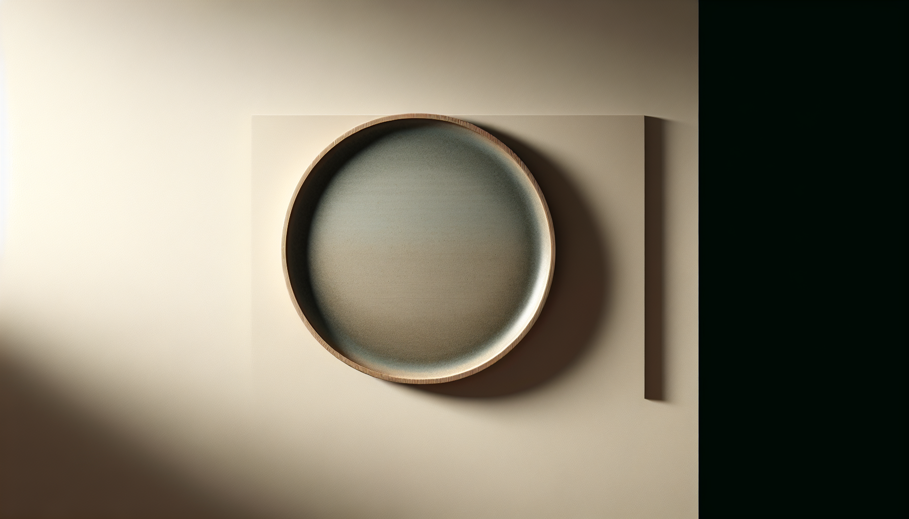
Wabi-sabi ceramics and sculptural tiles
Three-dimensional ceramic plates, tiles, or shallow wall-mounted bowls add tactile, handcrafted character to your walls. The small imperfections, matte glazes, and simple organic shapes celebrate wabi-sabi ideals.
You can arrange ceramic pieces in a modest cluster to create texture and visual interest without adopting a loud, gallery-like approach.
Textile hangings and woven art
Textiles bring warmth and softness to a typically restrained palette. Think neutral looms, simple woven panels, and monochrome tapestries with subtle patterning or texture rather than bold color or fringe-heavy boho details.
You should place textile art in areas where acoustics or coziness matter—behind a bed, near a reading nook, or in a living area—so they contribute to both comfort and the visual composition.
Traditional Japanese prints (ukiyo-e) and modern reinterpretations
Classic woodblock prints or modern interpretations reference Japanese heritage directly and pair naturally with the Japandi ethos. Choose pieces with restrained color schemes and serene subject matter like nature scenes or simple interiors.
Frame these prints with plain mats and simple wooden frames to keep the overall look understated while honoring cultural roots.
Abstract art with muted palettes
Subtle abstracts that emphasize texture, tone, and simple composition can work well in Japandi settings. You should look for works that use neutral, earthy, or soft pastels and that favor brushwork and texture over high-contrast imagery.
These pieces provide visual interest without disrupting the calm, and they can act as anchors for furniture groups.
Photography with calm subject matter
Black-and-white or desaturated photography that captures natural light, quiet landscapes, or simple architectural forms fits the Japandi mood. The matte finish and minimal framing are key to keeping photography in harmony with the style.
You should avoid high-saturation images, busy street scenes, or photos with strong graphic content that would conflict with the interior’s quiet feel.
Modular and geometric wood art
Wood wall panels, simple geometric forms, or shallow reliefs in natural wood tones echo the craftsmanship found in both Japanese and Scandinavian traditions. These pieces emphasize material and form rather than color.
You can use them to create accent walls or small compositions where texture and timber grain become part of the room’s fabric.
Matching materials and finishes to Japandi interiors
Your choice of materials affects both the look and the emotional tone of the room. Japandi favors tactile, natural finishes and restrained treatments.
Wood frames and paneling
Frames in light oak, walnut, or black-stained wood will harmonize with Japandi furniture. You should avoid overly ornate frames or glossy lacquered finishes—matte or raw finishes maintain the understated aesthetic.
Wood paneling as art or shallow wooden sculptures can tie wall art to furniture and flooring, reinforcing a cohesive material palette.
Paper, rice paper, and washi
Fine papers, especially washi and similar textured stocks, offer delicate translucency and subtle surface variation. Prints on these papers feel light and handcrafted.
You should protect them with UV-filtering glazing when necessary, but allow the paper’s texture to remain a visible part of the composition.
Linen and natural textiles
Canvas and linen give a subtle weave that reads as cozy and warm rather than flashy. Neutral-toned textile hangings anchored by simple dowels will fit a Japandi wall perfectly.
You should avoid embellished or heavily patterned textiles; keep weave and tone as the primary interest.
Ceramics, clay, and glazed surfaces
Handmade ceramic pieces with matte glazes and organic shapes bring an artisanal quality. Their imperfections and variation in color are desirable in the Japandi context.
You can mix several ceramic tiles or plates to create a modest arrangement that adds three-dimensional texture.
Metal as accent only
Metal is acceptable but should be used sparingly and in matte or aged finishes. Thin bronze, brass, or blackened steel frames or small sculptural elements work when balanced with wood and textile.
You should avoid shiny chrome or bright metals that introduce high contrast or a cold industrial feel.
How to choose scale, placement, and composition
The way you hang art is as important as the piece itself. Japandi favors balanced negative space, calm proportions, and easy sight lines.
Scale and proportion
You should choose art that’s proportionate to the furniture and wall it accompanies. Large, single pieces work well over sofas or headboards, while smaller groups suit hallways and nooks.
A good rule is to use art that occupies about two-thirds the length of a sofa or console to maintain visual balance without crowding.
Height and sightlines
Hang art with the center at roughly eye level—around 57–60 inches (145–152 cm) from the floor—so it reads naturally when you’re standing. For pieces above furniture, leave a 6–12 inch (15–30 cm) gap between the top of the furniture and the bottom of the frame.
You should consider the typical height of users in the home and adjust slightly for low-profile furniture or cultural preferences.
Negative space and breathing room
Leave generous empty space around each piece so it can be appreciated on its own terms. Grouped arrangements should have consistent spacing and similar framing or material to create unity.
You should avoid creating busy gallery walls unless they follow a carefully restrained palette and consistent composition.
Groupings and asymmetry
Small clusters of three to five objects, arranged slightly asymmetrically, often read as intentionally curated rather than cluttered. Asymmetry is a powerful tool because it echoes natural balance found in wabi-sabi.
You can mix materials—such as a framed print with a ceramic tile and a small wooden relief—so long as the overall color and tone remain harmonious.
Practical layout templates and measurements
You’ll find it helpful to use standard layouts when planning art placement. The table below summarizes common scenarios with recommended sizes and spacing.
| Location | Typical furniture size | Recommended art size | Gap between art and furniture | Notes |
|---|---|---|---|---|
| Above sofa | 72–96 in (183–244 cm) | 48–64 in (122–163 cm) wide (single) or triptych | 6–12 in (15–30 cm) | Keep art ~2/3 sofa width |
| Above bed (headboard) | 54–76 in (137–193 cm) | 36–54 in (91–137 cm) wide | 6–12 in (15–30 cm) | Use horizontal piece or two slim panels |
| Hallway | Variable | 16–30 in (41–76 cm) per piece | 2–4 in (5–10 cm) between frames | Keep frames small and evenly spaced |
| Dining area above console | 36–72 in (91–183 cm) | 24–48 in (61–122 cm) | 6–12 in (15–30 cm) | Art should not compete with dining lighting |
| Accent wall | Whole wall | Floor-to-ceiling panels or medium cluster | Leave breathing room at edges | Use vertical wood panels or modular art |
You should use these as starting points and adjust based on furniture style, wall height, and ceiling proportions.
Room-specific recommendations
You need to consider each room’s function and existing materials when selecting art. Below are tailored suggestions for common rooms.
Living room
The living room is often the focal point of a Japandi home, so choose one understated statement piece or a small cluster. Aim for calm subject matter, natural materials, and a frame that matches your wood tones.
You should avoid competing colors and large, highly detailed gallery walls that pull attention away from the room’s communal purpose.
Bedroom
For the bedroom, prioritize tranquil, comforting art—soft abstracts, muted landscapes, or textile hangings. These pieces should support relaxation and reflect a sense of stillness.
You’ll want to balance scale so the art complements the bed and headboard rather than dominating the space.
Entryway and hallway
These transitional spaces work well with slim, vertical pieces or a series of small, consistent frames. Simple photography or botanical studies offer a calm greeting without visual overload.
You should keep the hanging height slightly higher in narrow hallways to maintain flow and avoid a cramped feel.
Dining area
In dining areas, choose art that creates a warm atmosphere—textile art, ceramics, or serene prints in a horizontal format work well. The piece should harmonize with table finishes and the overhead lighting.
You should ensure the art doesn’t clash with the color or intensity of pendant lights, and allow for calm conversation without visual distraction.
Bathroom and kitchen
Moisture-resistant art or framed prints behind glass can be used in bathrooms and kitchens. Consider ceramic tiles, lightly glazed panels, or sealed photographic prints that match the room’s natural materials.
You should avoid delicate papers unless they’re framed and protected, and keep the palette cohesive with cabinetry and tile finishes.
Sourcing, commissioning, and DIY approaches
You will likely mix purchased, handcrafted, and DIY art to achieve a comfortable Japandi look. Here are pathways and tips.
Buying from makers and ethical brands
Supporting small makers and ethical brands aligns with Japandi values of craftsmanship and sustainability. Look for local ceramicists, weavers, printmakers, and woodworkers who use natural materials and low-impact processes.
You should prioritize pieces that show evidence of technique and material honesty rather than mass-produced finishes.
Commissioning custom work
Commissioning a bespoke piece lets you tailor scale, color, and material to your space. Many artists will work with you to choose paper types, glazes, and frames that match your interiors.
You should be clear about the aesthetic constraints—muted palette, natural textures, simplicity—to ensure the result fits the Japandi ethos.
DIY and upcycling
Simple DIY projects—such as framing pressed botanicals, stretching a neutral linen canvas, or creating small ceramic tiles—can add meaningful, personalized touches. Upcycling old frames with new matte finishes can be effective too.
You should focus on quality materials and simple forms so DIY pieces feel intentional rather than makeshift.
Where to shop
You can find suitable pieces at independent galleries, craft fairs, online marketplaces for handmade goods, and specialty boutiques focused on artisan-made decor. Museums shops sometimes carry limited-edition prints that match the aesthetic.
You should prioritize tactile inspection where possible to assess texture and finish; if buying online, request close-up photos and material specifications.
Lighting, hanging systems, and hardware
Proper lighting and hardware ensure your art reads correctly and lasts longer. Japandi favors subtle, functional solutions.
Lighting choices
Use warm, soft lighting such as LED strips with high CRI or adjustable picture lights that avoid glare. The goal is even illumination that highlights texture rather than producing harsh hotspots.
You should avoid dramatic color lighting or overly bright track lights that make a calm piece feel theatrical.
Hanging hardware
Concealed rails, slim picture hooks, or fixed hanging systems maintain clean lines. Use brass or matte black hardware that complements frames and wall tones.
You should always anchor heavy pieces with wall anchors suitable for your wall type (plaster, drywall, concrete) to ensure safety.
Protective glazing and finishes
Use non-reflective, UV-protective glass or acrylic for delicate papers and photographs. For tactile textiles and ceramics, place them out of direct sunlight and away from damp areas.
You should balance protection with aesthetic: matte glazing often reads more subtle and aligns better with Japandi principles than glossy finishes.
Maintenance and long-term care
You’ll want to maintain the simple beauty of Japandi art with gentle, consistent care. Materials such as paper and textiles require special attention.
Dusting and cleaning
Dust frames and surfaces with a soft cloth or brush. For textiles, use a gentle vacuum attachment on low power or spot-clean according to fiber guidelines.
You should avoid harsh chemicals or abrasive cleaners that can damage natural finishes.
Climate control and placement
Keep artworks away from direct sunlight, radiators, and humid or damp locations without proper sealing. Stable humidity and temperature preserve paper, wood, and textile pieces.
You should consider a small dehumidifier in humid climates and use museum-safe backings for paper works if humidity fluctuates.
Repair and restoration
Minor ceramic chips, slight warping in paper, or faded pigments may be repairable by professional conservators. Seek a conservator who understands natural materials and avoids invasive restoration that masks original character.
You should accept minor aging for wabi-sabi pieces, but ensure larger conservation work is handled by a specialist.
Mixing Japandi wall art with other décor elements
Your art should be part of a cohesive interior strategy. Think about how it interacts with furniture, lighting, plants, and smaller objects.
Color coordination
Use a limited palette of neutrals, muted pastels, and earthy tones across art and furnishings. A single accent color can be introduced sparingly through a print or textile if it repeats elsewhere in the room.
You should avoid introducing highly saturated hues that break the room’s serene cadence.
Texture layering
Layer textures—wood grain, woven textiles, matte ceramic glazes, and paper fibers—to create a tactile palette. These layers add warmth while preserving visual calm.
You should maintain balance by not combining too many competing textures in one focal area.
Repetition and rhythm
Repeat simple motifs, shapes, or materials across the room to create rhythm—such as matching frame wood to table legs, or repeating linen textiles in cushions and wall hangings. Repetition provides cohesion.
You should avoid literal copies; variations that share a common material or tone work best for subtle unity.
Quick decision checklist for choosing Japandi wall art
This short checklist will help you evaluate pieces quickly so choices remain intentional and coherent.
- Does the piece use natural materials or finishes?
- Is the color palette muted or neutral?
- Does the scale fit the furniture and wall proportions?
- Does it allow negative space around it to breathe?
- Does the texture or imperfection add warmth rather than distraction?
- Will its materials hold up in the chosen room environment?
- Does it complement rather than compete with existing focal points?
You should use this checklist during shopping or commissioning to ensure each piece supports the overall Japandi mood.
Comparison table: wall art types and how they fit Japandi
The table below summarizes common wall art types, their fit with Japandi principles, and recommended uses.
| Type of wall art | Japandi fit | Typical materials | Best rooms | Notes |
|---|---|---|---|---|
| Minimalist prints | Excellent | Paper, matte frames | Living room, bedroom | Keep frames simple; use muted inks |
| Botanical prints | Excellent | Paper, pressed plants | Hallway, living room | Use natural mats and wooden frames |
| Ceramic wall pieces | Very good | Clay, matte glazes | Dining, living, entry | Imperfections welcomed |
| Textile hangings | Very good | Linen, wool | Bedroom, living | Adds warmth and acoustic benefit |
| Wood reliefs/panels | Very good | Solid wood, veneer | Living room, accent wall | Emphasize grain and joinery |
| Traditional woodblock prints | Good | Paper, natural frames | Living room, study | Respectful framing is important |
| Photography (B&W/desaturated) | Good | Paper, glass | Hallway, bedroom | Use matte glazing |
| Bright abstract/colorful art | Limited | Canvas, acrylic | Rare, as accent | Use minimal color and texture |
You should consult this table when narrowing options to ensure each choice aligns with your intended mood and function.
Final thoughts and practical next steps
Now that you understand what types of wall art fit the Japandi mood, you can begin to curate pieces with confidence. Choose materials and compositions that emphasize quiet, natural beauty, and prioritize balance, proportion, and texture.
Start by measuring your walls and deciding which rooms need art, then apply the checklist and layout templates. Consider supporting local craft and commissioning pieces when you want a tailored result. Above all, aim for pieces that feel calm and meaningful—art that enhances the living space without overwhelming it.