Are you trying to find the perfect minimalist ceramics to bring calm, warmth, and balanced function into your Japandi space?
Minimalist Ceramics for Japandi Spaces
This article helps you choose ceramics that suit Japandi aesthetics: refined, functional, and quietly beautiful. You’ll learn about materials, shapes, colors, placement, care, and how to mix Scandinavian and Japanese influences without losing the minimalist intent.
What is Japandi and why ceramics matter
Japandi is a hybrid aesthetic that combines Japanese wabi-sabi sensibilities with Scandinavian simplicity and functionality. You’ll notice natural materials, muted palettes, purposeful design, and an emphasis on craft.
Ceramics are especially important because they bring tactility, warmth, and the handmade quality that both traditions value. A single ceramic piece can act as a functional object and an artistic focal point, helping you create calm, grounded interiors.
Core principles of Japandi design
These principles guide how you choose and place ceramics so they feel authentic in a Japandi room.
- Simplicity: You’ll favor clean lines and uncluttered forms.
- Natural materials: You’ll prefer clay, muted glazes, and visible textures.
- Functionality: Each piece should have a purpose; decorative items often double as usable objects.
- Imperfection: Slight irregularities and handmade marks are celebrated, not hidden.
- Balance: You’ll create harmony between negative space and well-chosen objects.
Why choose minimalist ceramics
Minimalist ceramics support Japandi by offering quiet, restrained beauty. You’ll enjoy pieces that:
- Add warmth to wood and neutral textiles.
- Create focal points without overwhelming the space.
- Serve daily routines like eating, drinking, and storage.
- Age gracefully and develop a patina with use.
Materials and finishes: what to look for
Different clays and finishes deliver distinct looks and durability. Below is a concise comparison to help you decide what fits your needs.
| Material | Look & Texture | Durability | Best uses |
|---|---|---|---|
| Porcelain | Smooth, refined, often translucent | High; chip-resistant if thin | Fine tableware, minimalist vases, refined tea sets |
| Stoneware | Matte or satin glazes, earthy textures | Very durable, everyday use | Dinnerware, mugs, serving bowls, planters |
| Earthenware | Rustic, porous unless glazed | Less durable, prone to chipping | Decorative pieces, indoor-only bowls, shallow dishes |
| Terracotta | Warm orange-brown, porous | Moderately durable; best indoors or sealed | Planters, rustic vessels, casual tableware |
| Salt/ash/glazed raku | Rustic, dramatic textures and crackle | More fragile; often decorative | Accent pieces, wabi-sabi vases, sculptural objects |
Choose based on how you’ll use the object: porcelain for refined dining, stoneware for daily dishes, terracotta for plants or rustic accents. For Japandi, prioritize neutral glazes and tactile surfaces.
Color palette and glaze choices
Japandi favors muted, nature-derived colors. When choosing glazes, you’ll want to think about how color affects mood and coordination.
- Neutral whites and off-whites: Provide a crisp, clean base and pair well with light woods.
- Soft greys and taupes: Add subtle depth without drawing attention.
- Warm beiges and clay tones: Introduce warmth and natural earthiness.
- Deep indigo or muted black: Use sparingly for contrast and visual anchors.
- Pale celadon and moss greens: Nod to Japanese ceramics while remaining subdued.
Matte and satin glazes often feel more authentic to Japandi because they reduce glare and emphasize texture. Slight speckling, unevenness, and subtle pooling are desirable—these qualities read as handmade and lived-in.
Shapes and forms to favor
In Japandi spaces, form follows function but with an emphasis on purity and balance. Consider these shape categories:
Low, rounded forms
Low bowls, shallow plates, and squat vases create a calm, grounded look. You’ll use these on dining tables and low shelves to maintain visual flow.
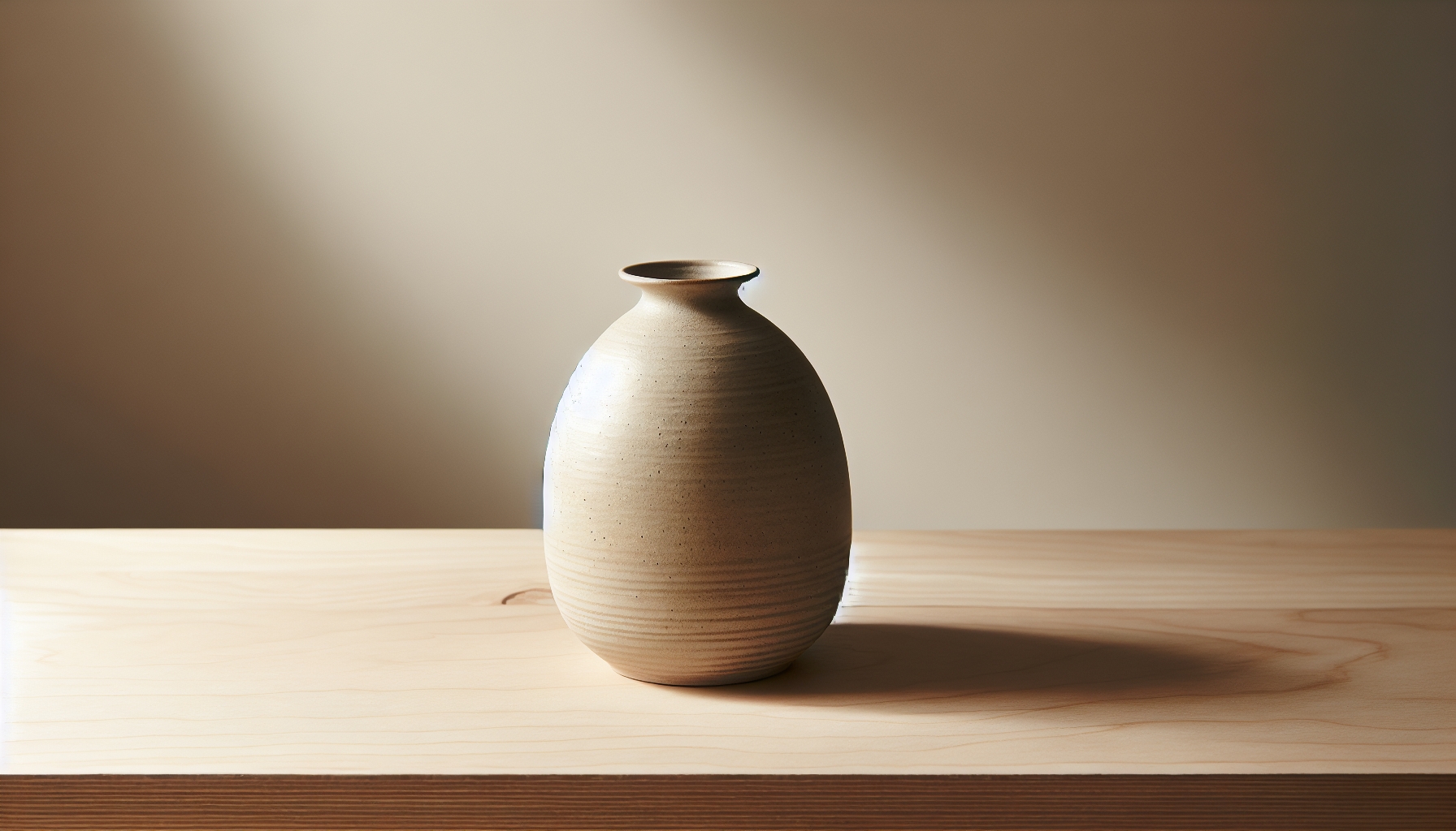
Cylindrical and tapering forms
Tall cylindrical vases, mugs with straight sides, and tapered vessels echo Scandinavian geometry while remaining simple. They’re easy to hold and align well on surfaces.
Organic, asymmetrical forms
Subtle asymmetry and hand-formed edges add personality. You should choose pieces where irregularities are small and intentional—enough to feel handmade but not chaotic.
Stackable, nested forms
Nesting bowls and stackable plates are practical for small spaces. They keep clutter down and align with minimalism by offering multifunctional storage.
Flat and tray forms
Flat plates, serving platters, and shallow trays help you keep surfaces orderly. Use them as staging areas for candles, keys, or tea sets.
Function-first approach
Every ceramic item should earn its place in your home. Ask yourself: do I need this piece to be useful or purely decorative? If it’s decorative, can it double as functional on occasion?
- Daily tableware: Choose durable, dishwasher-safe stoneware for everyday.
- Occasional tableware: Reserve more delicate porcelain for guests and special meals.
- Vases: Pick sizes that work with the scale of your furniture and the types of stems you’ll use.
- Storage jars: Use lidded stoneware for pantry staples, coffee, or loose tea.
- Accent objects: Keep these minimal; one sculptural piece can be more effective than several small ones.
Styling ceramics by room
How you place ceramics should respond to the room’s function and flow.
Living room
Use a single sculptural vase or a small set of nested bowls on a coffee table. You’ll want to keep surfaces airy, so limit pieces to one or two focal items. Consider a neutral ceramic tray for remote controls, or a low, wide bowl filled with seasonal botanicals.
Dining room
Mix functional tableware with a well-proportioned centerpiece. You can use a long ceramic platter for shared dishes and pair it with simple stoneware plates. Keep place settings minimal and consistent in color or texture.
Kitchen
Store frequently used items in tactile jars or open canisters. You’ll appreciate stoneware containers for coffee, sugar, and utensils. Keep heavier or decorative ceramics on higher shelves out of the way.
Bedroom
A small ceramic dish on your nightstand becomes a restrained catchall for jewelry and daily items. A delicate tea bowl or a tiny bud vase can bring calm without clutter.
Bathroom
Use simple soap dishes, toothbrush holders, or a small tumbler in matte glaze. Neutral colors and waterproof ceramics work best here.
Entryway
A shallow bowl or tray near the door is great for keys and daily items. Choose a durable, easy-to-clean glaze that still reads as refined.
Display and composition techniques
How you arrange ceramics affects the overall atmosphere. Use these compositional strategies:
- Embrace negative space: Give objects room to breathe instead of crowding them.
- Apply the rule of three sparingly: Grouping two or three pieces creates visual interest without clutter.
- Vary heights and textures: Combine a tall vase with a low bowl and a textured cup to craft a subtle vignette.
- Align with wood grain and light sources: Place ceramics so their shapes complement furniture lines and catch soft light.
- Anchor with a base surface: Use trays, placemats, or folded linens to ground ceramic groupings.
Mixing Japanese and Scandinavian elements
You’ll find harmony by balancing warmth with restraint.
- Pair warm wood tones with cool matte glazes: This contrast mirrors the Scandinavian love of pale wood and the Japanese preference for subdued ceramics.
- Use simple, geometric Scandinavian forms with slightly irregular Japanese textures: The interplay keeps things interesting.
- Keep clutter minimal: Both traditions prize order. Let each piece have purpose and presence.
- Bring natural fibers: Linen napkins or wool throws complement ceramics and reinforce tactile coherence.
Practical table: pairing ceramics with wood tones
| Wood tone | Ceramic colors/finishes that work well | Suggested pieces |
|---|---|---|
| Light oak | White, pale grey, soft celadon, matte | Dinnerware, small vases |
| Warm walnut | Off-white, warm beige, speckled stoneware | Serving bowls, teapots |
| Bleached pine | Cool grey, soft blue, porcelain | Mugs, plates, minimalist vases |
| Dark stained wood | Deep indigo, black, warm clay | Accent pieces, large vases |
Use this as a quick guide when coordinating ceramics with your existing furniture.
Sizing and scale guidelines
Ceramics should harmonize with furniture scale and room proportion.
- For coffee tables: Choose low pieces 4–8 inches tall so sightlines remain open.
- For dining tables: Centerpieces should be short enough to allow conversation—typically under 8–10 inches.
- For shelves: Alternate small and medium pieces; avoid very tall items unless the shelf height supports them.
- For mantels: One or two low to medium pieces create balance. Avoid too many small items that read as clutter.
Care and maintenance
Proper care helps your ceramics last and age gracefully.
- Dishwasher vs. hand-wash: Stoneware is often dishwasher-safe; porcelain can be too, but hand-washing extends life and preserves glazes.
- Avoid thermal shock: Don’t move pieces directly from hot ovens to cold surfaces; sudden temperature changes cause cracking.
- Storage: Stack with soft liners to prevent chipping; use felt or cloth between pieces.
- Stain removal: Baking soda paste or gentle vinegar rinses can lift stains. Avoid harsh abrasives on matte glazes.
- Repair and acceptance: Small chips or crazing can be repaired or embraced as part of the piece’s life. Kintsugi (gold repair) is a Japanese tradition that celebrates repair and could be a thoughtful choice if you want visible mending.
Sustainable sourcing and ethical considerations
You can make choices that support craft and reduce waste.
- Buy from local potters or small studios to support artisans.
- Look for lead-free glazes and transparent material sourcing.
- Consider secondhand or vintage ceramics—these items often come with history and character.
- Choose durable materials that reduce replacement frequency.
Budgeting and where to source ceramics
You don’t need to spend a fortune to get authentic-looking pieces. Here are practical options to match different budgets:
- Budget-friendly: Mass-produced stoneware in neutral tones—good for everyday tableware.
- Mid-range: Work by independent ceramists sold online or at local markets—better glaze quality and small-batch uniqueness.
- Investment pieces: Hand-thrown porcelain or collectible works—choose these for special spots where you want a lasting focal point.
Table: sourcing options
| Price level | Where to look | What to expect |
|---|---|---|
| Low | Retail home stores, basic pottery collections | Consistent shapes, affordable, machine-made |
| Mid | Local pottery markets, Etsy, small boutiques | Handmade variation, better materials |
| High | Gallery pieces, commissioned work | Unique artistry, premium materials, collectible |
Buying checklist
Use this checklist to evaluate each piece before you buy.
- Purpose: Is it functional or decorative?
- Size/scale: Does it fit your intended display or use?
- Material: Stoneware, porcelain, earthenware—does it match your use case?
- Finish: Matte, satin, glossy—does it coordinate with your room?
- Durability: Dishwasher and oven safety if needed.
- Craftsmanship: Are glazes and footrings well executed?
- Price: Is this within your budget and justified by quality?
Common mistakes to avoid
You’ll create a more coherent Japandi space if you avoid these pitfalls.
- Over-collecting: Too many small items lead to clutter and contradict minimalism.
- Mixing too many colors: Stick to a restrained palette to maintain calm.
- Ignoring scale: Large pieces on small furniture or vice versa disrupt balance.
- Prioritizing novelty over function: A pretty but impractical piece loses value in daily living.
Incorporating seasonal changes
Ceramics adapt well to seasonal styling. You’ll find that subtle swaps refresh the space without redesigning.
- Spring: Use pale celadon and shallow bowls for early blooms.
- Summer: Introduce cool greys and light porcelain for a breezy feel.
- Autumn: Bring in warm clay tones and deeper glazes.
- Winter: Use deep indigo or matte black for contrast and add textured linens.
Rotate a single piece or two to mark the season, keeping the rest of your palette stable.
DIY and personalization ideas
If you want a hands-on approach, try these beginner-friendly routes.
- Attend a wheel-throwing or hand-building class to make one signature piece.
- Glaze small tiles or coasters for custom color accents.
- Refinish thrifted ceramics by cleaning, relabeling, or using them as planters.
- Commission local potters for pieces that fit your scale and palette exactly.
Learning basic care and handling will also help you appreciate the craft and make better purchasing choices.
Glossary of ceramic terms
| Term | Meaning |
|---|---|
| Bisque | Unglazed, fired clay before glazing; porous surface |
| Glaze | Glassy coating applied to ceramics for color and sealing |
| Stoneware | Dense, durable ceramic fired at high temperatures |
| Porcelain | Fine, white, often translucent ceramic with smooth finish |
| Slip | Liquid clay used for decoration or joining pieces |
| Footring | The unglazed ring at the base of a vessel where it rests |
| Crazing | Fine crackle in glaze, sometimes decorative |
| Kintsugi | Japanese art of repairing pottery with visible seams, often gold |
Examples of starter pieces for your Japandi collection
Start with a small, curated set that covers daily needs and styling:
- One set of neutral stoneware dinner plates (4–6 pieces).
- Two to four mugs in a coordinated matte glaze.
- A low, wide serving bowl for the table.
- One medium cylindrical vase for stems.
- One lidded jar for kitchen storage.
- One small catchall dish for the entryway or nightstand.
This selection gives you functional coverage while keeping visual cohesion.
When to choose bold ceramics
Minimalism doesn’t mean never using contrast. You can introduce a bold piece if it acts as an anchor and you keep the rest restrained.
- Use one dark or richly textured item per room to create depth.
- Place it against pale surfaces or neutral textiles for maximum effect.
- Ensure the piece complements rather than competes with your overall palette.
Final tips for lasting harmony
- Edit often: Remove items that no longer serve you to maintain balance.
- Invest in versatile pieces: Items that are both beautiful and useful will earn their place.
- Choose tactility: Textured, matte surfaces help create cozy minimalism.
- Respect light and space: Ceramic surfaces respond to natural light—position them to benefit from gentle illumination.
Conclusion
You’ll achieve a successful Japandi aesthetic by choosing minimalist ceramics that combine simplicity, natural materials, and purposeful function. Prioritize tactile finishes, neutral palettes, balanced compositions, and a small number of carefully selected pieces. Whether you buy mass-produced stoneware or a hand-thrown porcelain bowl, make each purchase intentional so your space remains calm, functional, and quietly beautiful.