Have you ever wondered how a room can feel calm, uncluttered, and warmly inviting all at once?
Japandi Textures That Balance Warmth and Minimalism
You’re looking at a design style that brings together two distinct aesthetics — Japanese restraint and Scandinavian comfort — to create spaces that feel both intentional and welcoming. This article will guide you through textures, materials, and practical strategies so you can make your home feel balanced, tactile, and serene without losing the minimalism you value.
What people think Japandi really means
People often assume Japandi is simply a mix of Japanese and Scandinavian furniture or a neutral color palette. While those elements are part of it, the style is really about a careful balance: you want clean lines and function, but you also want warmth and tactility. If you treat Japandi as a surface trend, you’ll miss the deeper philosophy that informs material choices, composition, and the way you use negative space.
Many misunderstandings come from focusing only on looks. You might see photos of sleek rooms and think Japandi is purely minimalism with wooden furniture. In practice, it’s also about texture hierarchy, material honesty, and the way objects age gracefully over time. When you understand that, you’ll make decisions that create a more authentic and durable environment.
Origin and Philosophy
You should know that Japandi is not a brand-new invention; it’s a natural marriage of two design lineages. Japanese design emphasizes restraint, craftsmanship, and the beauty of imperfection, while Scandinavian design emphasizes functionality, light, and cozy comfort. When you combine these philosophies, you get an approach that prizes careful material selection, simplicity of form, and the sensory experience of a room.
Beyond aesthetics, Japandi has ethical echoes: it values longevity, sustainable materials, and purposeful ownership. You’re encouraged to choose fewer, better items and to think about how each object serves daily life. That mindset will help you prioritize textures that age well and that build a tactile narrative over time.
Common Misconceptions
There are a few common myths you should be aware of so you don’t misapply the style. First, Japandi is not the same as bland minimalism. You don’t want sterile white boxes; you want warmth through texture and tone. Second, it’s not about copying a specific catalog of pieces; adapting materials and forms to your climate, lifestyle, and budget matters more.
Another misconception is that Japandi is only for high-end or new homes. You can bring the principles into any space by choosing simple edits, adding tactile textiles, and making small material swaps. With the right focus, you’ll get the sense of calm and tactile richness that defines the style.
Core Principles of Japandi Textures
When you think about textures in Japandi, aim for coherence rather than variety for its own sake. Textures should complement each other and contribute to a sense of warmth and calm. You’ll want a mix of smooth and coarse, matte and slightly lustrous surfaces that together create visual interest without clutter.
Balance is essential. Too many rough textures will make the space feel heavy, while too many smooth textures will make it feel cold. You should also think about scale — large, subtle textures for backgrounds (like floors and walls) and smaller, more intricate textures for accessories and textiles.
Natural Materials
Natural materials are at the heart of Japandi because they offer intrinsic texture and age gracefully. You’ll use wood, stone, clay, and natural fibers to create an environmental narrative that feels authentic and grounded. These materials also give your home subtle variations in tone and texture that artificial materials usually lack.
When you choose natural materials, look for honest finishes and minimal processing. You’ll often prefer matte or hand-finished surfaces because they read as more tactile and human. Over time, these materials will develop a patina that enhances their character rather than detracts from it.
Muted Color Palette
A muted palette supports texture by allowing surface qualities to be the focal point rather than loud colors. You’ll find that soft neutrals, warm beiges, charcoal, and muted greens let textures sing without visual competition. Textures become more noticeable when color is restrained.
This doesn’t mean you can’t use color at all. Accent tones should be thoughtful and limited so they enhance, rather than overpower, texture. When you pair muted tones with tactile materials, your space will feel balanced and calm.
Tactile Contrast
You should intentionally create contrast between textures to add depth without clutter. Pair smooth and rough surfaces — for example, a polished tabletop with a hand-thrown ceramic vase, or a soft wool rug with a matte oak bench. This contrast creates visual rhythm and keeps the minimal composition from feeling flat.
Tactile contrast is also about scale and density. Combine loosely woven textiles with tight-grain woods or dense stone with airy paper elements. The contrasts should feel measured and purposeful.
Simplicity and Function
Japandi texture choices are guided by function: texture should support comfort, durability, and usability. You’ll choose textiles that are comfortable to touch and easy to care for, and finishes that resist wear in high-traffic areas. Form follows function, and texture follows both.
Adopt a design mindset where each texture serves a reason. If it’s purely decorative and adds no sensory or functional value, consider whether it aligns with the Japandi ethos of intentional living.
Key Textures and Materials to Use
Below are the primary textures you’ll want to focus on. For each, you’ll find what it brings to a space and practical tips on how to use it.
Wood (Oak, Ash, Beech, Bamboo)
Wood is the backbone of Japandi. It brings warmth, natural grain, and a sense of craftsmanship. You’ll often see light to medium tones that provide a neutral base and warm undertone.
Tips: Prefer matte or satin finishes to keep the tactile quality. Match the wood tone across large-scale elements (floors, major furniture) and use slightly different woods in smaller pieces for subtle contrast. For sustainability, choose FSC-certified or reclaimed wood.
Stone (Granite, Limestone, Slate)
Stone adds solidity and weight. You’ll use stone in hearths, countertops, and occasional accent walls. The coolness of stone balances the warmth of wood and textiles.
Tips: Use honed finishes for a subdued, tactile surface. Place stone where you want visual grounding and heat-resistant durability. Combine with warmer textiles to keep it from feeling cold.
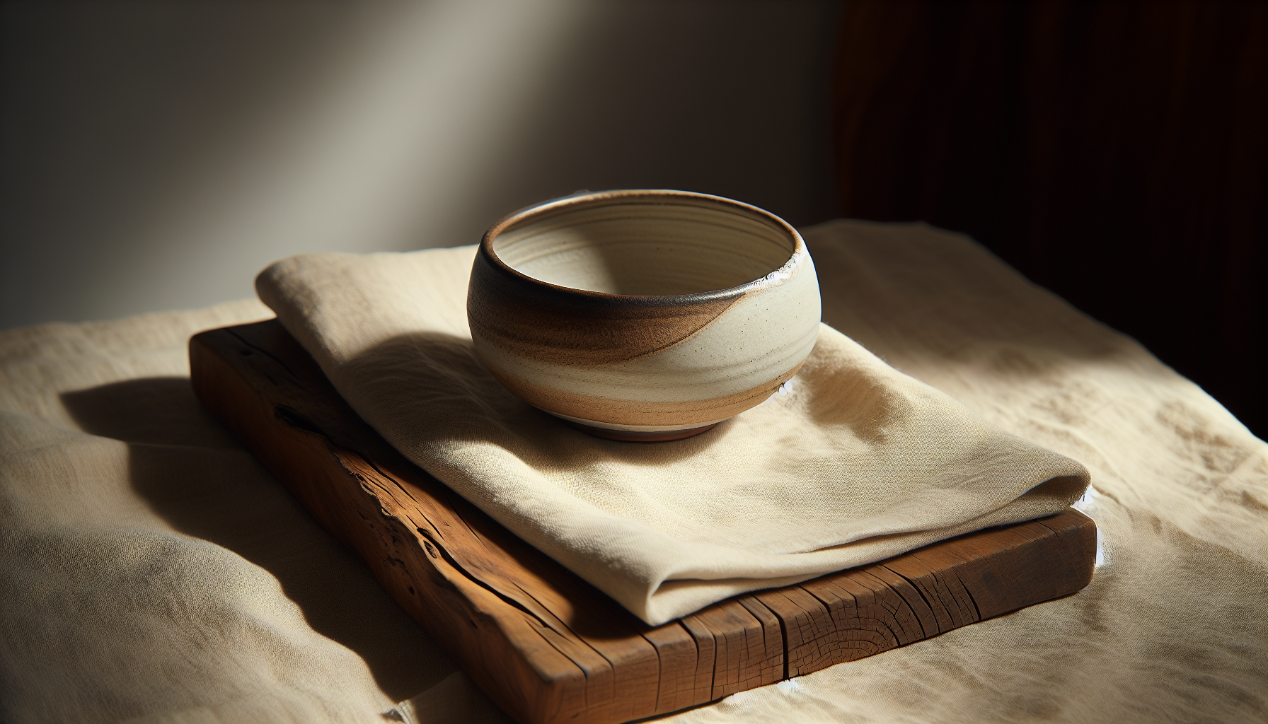
Clay and Ceramics (Hand-thrown Pottery)
Ceramics add handcrafted charm and imperfect surfaces that feel human. They introduce small-scale textures and visual focal points.
Tips: Use artisanal ceramics as focal points on shelves, tables, and in kitchens. Mix matte glazes with unglazed clay for contrast. Don’t be afraid of irregularities — they’re part of the Japandi story.
Textiles (Linen, Wool, Cotton)
Textiles are where you create softness and comfort. Linen brings crisp natural texture, wool provides warmth and loft, and cotton offers versatility and easy care.
Tips: Layer textiles in your seating and bedding for tactile richness. Keep patterns minimal and prefer slub weaves or subtle structures. Prioritize natural fibers for breathability and longevity.
Paper and Shoji (Washi Paper)
Paper elements, especially inspired by shoji screens, contribute translucency and soft diffusion of light. You’ll use paper in lamps, room dividers, and wall accents.
Tips: Use paper in areas where you want soft, filtered light. Keep frames simple and low-contrast to maintain minimal lines. Consider durable modern alternatives if you need higher durability.
Metal (Matte Brass, Blackened Steel)
Metal accents provide structural punctuation and edge. You’ll use them in hardware, lighting, and small furniture legs.
Tips: Choose matte or brushed finishes rather than shiny chrome. Blackened metals read as calm and sculptural, while warm brass can add a subtle glow when used sparingly.
Rattan and Wicker
Rattan adds an organic woven texture and lightness. You’ll use it in chairs, baskets, and lamps for an approachable bohemian note that pairs well with Japandi warmth.
Tips: Use rattan for accent pieces and storage. It’s best paired with solid woods and neutral textiles to keep the look intentional.
Leather (Vegetable-Tanned or Natural Finishes)
Leather introduces smoothness and luxury without glamour. It develops character over time and pairs well with wool and wood.
Tips: Opt for vegetable-tanned, minimally finished leathers if you want the patina to evolve. Use leather in chairs or small accents, and avoid overly glossy finishes.
Concrete and Plaster
Plaster and cement surfaces provide matte, tactile backdrops and an artisanal feel. You’ll use them on walls or countertops for a modern, grounded look.
Tips: Keep concrete minimal and warm it up with wooden accents and soft textiles. Use microcement or lime plaster for subtler texture.
Felt and Soft Panels
Felt can be used for acoustics, cushiony furniture, and wall elements. It softens acoustics while adding a dense, warm texture.
Tips: Use felt in home offices or bedrooms to control sound. Choose muted colors and clean shapes to keep the minimal aesthetic.
Texture Comparison Table
| Texture / Material | Feel & Visual | Typical Use | Best Paired With |
|---|---|---|---|
| Oak / Ash Wood | Warm, grainy, matte | Flooring, furniture, shelving | Linen, wool, stone |
| Stone (Limestone) | Cool, solid, natural variance | Hearths, counters, accent walls | Wood, soft textiles |
| Hand-thrown Ceramics | Slightly rough, irregular glaze | Vases, dishes, decor | Wood, linen |
| Linen | Crisp, breathable, slub texture | Curtains, bedding, upholstery | Wood, rattan |
| Wool | Soft, insulating, textured | Rugs, throws, cushions | Leather, stone |
| Washi Paper | Translucent, delicate | Screens, lamps, wall accents | Wood frames, muted lighting |
| Blackened Steel | Matte, structural | Lighting, hardware, legs | Wood, leather |
| Rattan | Woven, lightweight | Chairs, baskets, lamps | Linen, oak |
| Vegetable-tanned Leather | Smooth, patina-developing | Chairs, handles, poufs | Wool, wood |
| Plaster/Concrete | Matte, slightly grainy | Walls, floors, counters | Wood, soft textiles |
How to Layer Textures for Warmth and Minimalism
Layering textures is a deliberate process in Japandi design. You’ll want to create a hierarchy: base layer (architectural surfaces), middle layer (large furniture), and accent layer (textiles and objects). When you layer thoughtfully, you achieve warmth without clutter.
Start by defining the base: floors, major walls, and large built-in pieces. Those surfaces should have subtle, steady textures like wood floors or plaster walls that act as a neutral backdrop. Next, choose mid-scale textures such as sofa fabric, a wooden coffee table, or a bed frame. Then finish with accents: cushions, pottery, woven baskets, and small metal objects that provide tactile punctuation.
Living Room
In the living room, think in three tiers. Your base layer could be wide-plank oak floors and a plaster wall. For the middle layer, use a low-profile sofa in linen and a solid wood coffee table. Accent with a chunky wool throw, a rattan basket, and a matte ceramic vase.
Focus on balance: if you choose a heavily textured rug, keep upholstery smooth. If your furniture has visible grain, complement it with soft, low-patterned textiles.
Bedroom
The bedroom should feel calm and tactile. Start with warm wood flooring or a neutral low-pile rug. For the middle layer, a simple wooden bed frame and linen bedding create a clean foundation. Accent with wool throws, a leather bench, and handcrafted bedside ceramics.
You’ll want the bedroom to be a tactile retreat, so incorporate soft, breathable textiles and natural finishes that invite touch and rest.
Kitchen
In the kitchen, prioritize durable textures that still feel warm. Use stone or matte quartz countertops, simple wooden cabinetry with flat or recessed panels, and hand-thrown ceramic dishware. Textural accents can include woven placemats, linen napkins, and a rattan pendant lamp if appropriate.
Keep surfaces easy to clean, and use textured objects rather than textured countertops in high-prep areas to avoid maintenance headaches.
Bathroom
Bathrooms benefit from tactile contrast: matte stone or plaster walls with wooden shelving and soft cotton towels. A textured tile in neutral tones can provide interest behind a vanity without overwhelming the minimal composition.
Choose finishes that tolerate humidity and are easy to maintain. Soft accents like a wool bath mat or woven baskets add warmth without compromising practicality.
Home Office
In your workspace, textures should support focus and comfort. A wood desk, a felt pinboard, and linen or leather desk accessories create a calm environment. Use a soft rug underfoot to anchor the space and reduce echoes.
Function is crucial: make sure tactile choices don’t hinder ergonomics. For example, a textured chair fabric should be breathable and supportive for long periods of sitting.
Layering Examples Table
| Room | Base Layer | Middle Layer | Accent Layer |
|---|---|---|---|
| Living Room | Oak floors, plaster wall | Linen sofa, oak coffee table | Wool throw, ceramic vase, rattan basket |
| Bedroom | Neutral rug, painted plaster | Solid wood bed, linen bedding | Leather bench, wool throw |
| Kitchen | Matte stone counter, wood cabinets | Minimal hardware, open shelving | Linen napkins, ceramic bowls |
| Bathroom | Matte tiles/plaster | Wooden shelves, stone vanity | Cotton towels, woven basket |
| Home Office | Wide plank floor | Wood desk, ergonomic chair | Felt board, linen accessories |
Color and Texture Interaction
Color and texture are partners in setting mood. You’ll use warm neutrals — soft beiges, warm greys, muted greens, and charcoal — to let texture stand out. Textural variation within a limited color range keeps the space visually interesting without becoming busy.
When you combine textures of similar tone, the room feels cohesive and calm. For contrast, bring in a darker tone or a slightly different hue in smaller elements to anchor visual sightlines. The key is to control saturation so texture remains the primary visual language.
Suggested Color Palette
- Warm ivory and off-white for backgrounds.
- Soft beige and taupe for mid layers.
- Muted greys and charcoal for accents.
- Olive or desaturated sage for subtle color.
- Warm wood tones as a structural color.
Pair these tones with different textures to create depth. For instance, a charcoal matte metal lamp will have more presence against a warm ivory plaster wall than against a dark surface.
Lighting and Texture
Lighting affects how textures read, so plan lighting with surface qualities in mind. Proper lighting will enhance texture without creating harsh shadows that feel stark.
Natural Light
Natural light reveals texture in a gentle way and changes throughout the day, offering a dynamic quality that complements natural materials. You’ll want to maximize diffused natural light with sheer linen curtains or shoji-inspired screens. This soft lighting emphasizes warm wood and tactile textiles.
Avoid direct, harsh sunlight on delicate materials to prevent fading. Use adjustable window coverings so you can control the intensity of natural light.
Ambient and Accent Lighting
Ambient lighting should be warm and layered. You’ll use overhead fixtures that offer soft, even light and combine them with floor and table lamps that highlight texture on surfaces. Accent lighting can pick out ceramics, wood grain, or a textured wall.
Choose warm bulbs (around 2700–3000K) to enhance the warmth of natural materials. Use matte or soft-finished lamp shades to avoid glare.
Task Lighting
Task lighting should be focused and functional, with finishes that match your overall material palette. A blackened steel or matte brass desk lamp provides a sculptural yet restrained accent. Task lights should be adjustable to support function while keeping visual minimalism.
Furniture and Decor Choices
You’ll want furniture with clean lines and material honesty. In Japandi, silhouettes are often simple and low to the ground, which emphasizes negative space and the textures of chosen materials.
Choose pieces that combine form and function: a simple bench that doubles as storage, a low-profile sofa with a removable linen cover, or an open shelving system crafted from a single, beautiful wood. Avoid heavy ornamentation and let joinery details and material quality be the ornament.
Choosing Furniture Textures
Select furniture textures that read as natural and tactile. A matte wood table, a linen-upholstered chair, or a ceramic lamp base will all contribute to a coherent tactile story. Consider scale and proportion so that texture doesn’t overwhelm.
When you introduce upholstery, prioritize pieces with tight, minimal seams and natural fiber covers that can be cleaned or remade in the future.
Accessorizing with Textiles
Accessories are where you can be more flexible and seasonal. You’ll rotate throws, cushions, and rugs to change the tactile feel of a room across seasons. Keep patterns minimal and textures varied: a basket weave cushion, a chunky knit throw, and a low-pile rug can coexist harmoniously.
Use textiles to introduce softness in harder spaces like kitchens and to add comfort in living rooms and bedrooms.
Flooring and Rugs
Flooring should be a solid base for other textures: wide-plank wood or smooth stone is ideal. Rugs anchor seating areas and add immediate texture underfoot. Choose rugs with natural fibers (wool, jute, cotton) and simple patterns or tonal variations.
Make sure the rug scale suits your furniture layout so you achieve visual balance and comfortable transitions between surfaces.
Maintenance and Longevity
Japandi values longevity, so you should select textures that can be maintained and that improve with age. Natural materials generally patinate in pleasing ways, but they also require specific care.
Cleaning
Follow manufacturer guidelines for each material. For textiles, use removable covers where possible and rotate cushions to distribute wear. For wood, use gentle cleaners and avoid harsh chemicals. Stone should be sealed appropriately and cleaned with pH-neutral products.
A gentle maintenance routine will protect materials without stripping their natural qualities.
Repair and Patina
Embrace repair and the aesthetics of aging. You’ll often find that minor scratches or patina add character and authenticity. Learn basic repair skills — refinishing a tabletop, patching plaster, re-sewing cushion covers — so you can extend the life of your pieces.
Consider purchasing items that can be reconditioned, rather than disposable goods.
Choosing Durable vs Delicate
Be pragmatic about where you place delicate textures. Reserve artisanal ceramics or paper elements for lower-traffic areas while choosing durable finishes for kitchens and bathrooms. You should balance visual interest with practical durability.
Common Mistakes and How to Avoid Them
You’ll often see certain pitfalls when people try to adopt Japandi. The biggest mistakes are treating the style as a checklist of objects, over-texturing, or creating a room that’s minimalist but cold. Avoid copying images without adapting them to your lifestyle.
Instead of accumulating objects, edit ruthlessly. Make sure each piece has a function or a meaningful presence. Keep a coherent palette and don’t introduce too many competing materials. If in doubt, reduce one element rather than add another.
Another mistake is ignoring scale. A room with several oversized textured items can feel heavy rather than balanced. Pay attention to proportion and breathing space.
Sourcing and Budget Tips
You don’t need a large budget to achieve Japandi textures. Focus on a few key investments and complement them with budget-friendly accents. Secondhand markets, local artisans, and DIY refinishing can get you high-quality textures for less.
- Buy one good sofa or bed and complement it with inexpensive throws and cushions.
- Refurbish thrifted wood furniture rather than buying new mass-produced pieces.
- Look for local potters for unique ceramics that add tactile interest.
- Use budget-friendly materials like linen from lower-cost suppliers for curtains and covers.
Prioritize items you’ll touch frequently — upholstery, bedding, rugs — and spend more on those for comfort and longevity.
Final Checklist for Creating Japandi Texture Balance
Below is a practical checklist to help you evaluate your room and ensure you’re achieving warmth and minimalism through texture. Use it when you’re planning or editing a space.
| Task | Why it Matters | Action |
|---|---|---|
| Define Base Materials | Create a cohesive backdrop | Choose wood floors or plaster walls in warm neutrals |
| Limit Color Palette | Keeps texture the focus | Stick to 3–5 harmonious muted tones |
| Layer Textures | Add depth without clutter | Use base, middle, and accent layers |
| Prioritize Natural Fibers | Enhance tactility and longevity | Select linen, wool, cotton, natural leather |
| Choose Matte Finishes | Maintain calm visual energy | Avoid high-gloss metals and plastics |
| Edit Accessories | Maintain minimalism | Keep only meaningful decor and rotate seasonally |
| Plan Lighting | Highlight textures thoughtfully | Use warm bulbs and layered lighting |
| Consider Durability | Match materials to use | Reserve delicate textures for low-traffic spots |
| Embrace Patina | Allow materials to age gracefully | Repair rather than replace when possible |
Closing Thoughts
You’re aiming for an interior that respects restraint while inviting touch. Japandi textures are not about mimicking a look exactly; they’re about creating a tactile, thoughtful environment where every surface and material contributes to warmth and calm. With careful layering, restrained color, and a focus on natural, honest materials, you’ll create spaces that feel both minimal and deeply lived-in.
Start small if you need to — swap bedding to linen, add a wool rug, or bring in a ceramic piece — and build a tactile story over time. The result will be a home that’s pared back, practical, and quietly luxurious in its textures.