How can you bring the timeless beauty of traditional Japanese prints into your modern home without feeling out of place?
Incorporating traditional Japanese prints into modern interiors
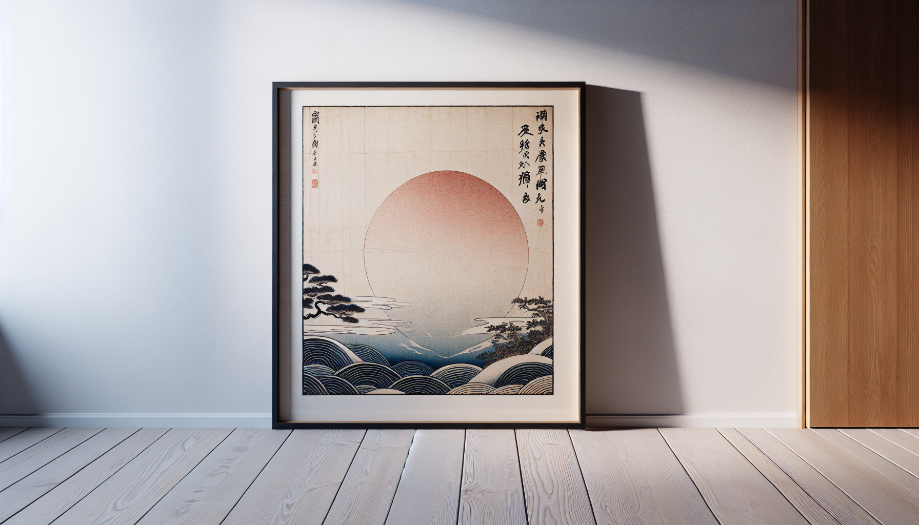
Traditional Japanese prints can add refinement, color, and narrative to contemporary spaces. You’ll learn how to choose, place, frame, and care for prints so they feel integrated and intentional rather than like a pasted-on decoration.
Why traditional Japanese prints work in modern interiors
Traditional Japanese prints blend strong composition, refined color use, and narrative scenes that complement modern design principles. You’ll find that their focus on negative space, pattern, and balanced asymmetry pairs naturally with minimalism, mid-century modern, and contemporary eclectic interiors.
Understanding the main types of Japanese prints
You’ll want to know the differences between print types so you can choose the right aesthetic and budget.
| Print type | Time period / format | Visual features | Typical subjects |
|---|---|---|---|
| Ukiyo-e | 17th–19th century, multi-block woodblock prints | Bold outlines, flat color areas, flowing compositions | Kabuki actors, courtesans, landscapes, everyday life |
| Nishiki-e | Late ukiyo-e form, multi-colored | Rich palette, layered textures | Landscapes, portraits |
| Surimono | 18th–19th century, deluxe privately commissioned prints | Fine printing, metallics, poetry, small edition | Festive or poetic themes |
| Emakimono (painted scrolls) | Pre-modern hand-painted scrolls and illustrations | Long narrative scenes, sequential storytelling | Myths, historical tales |
| Bijin-ga | Subgenre of ukiyo-e | Elegant women, refined detail | Beauties, fashion portraits |
| Shin-hanga / Sosaku-hanga | 20th-century revival and creative prints | Modern sensibilities, varied styles | Landscapes, everyday scenes, modern design motifs |
Key aesthetic elements you should understand
Japanese prints are built on compositional principles you can use when arranging interiors.
- Ma (negative space): You’ll notice areas of calm that give images breathing room; this works well in modern settings that value simplicity.
- Asymmetry: Balanced but uneven compositions will help your rooms feel dynamic and organic.
- Seasonal motifs: Cherry blossoms, chrysanthemums, waves, and snow convey a sense of seasonality and mood.
- Pattern and repeat: Wave (seigaiha), hemp leaf (asanoha), and tortoise-shell (kikkō) patterns are both decorative and symbolic.
Choosing prints: original versus reproduction
Your budget and intention will guide whether you seek originals, vintage prints, or modern reproductions.
- Originals: You’ll pay a premium for 18th- or 19th-century ukiyo-e. Originals have cultural and historical value and often require conservation and insurance.
- Vintage editions: 20th-century shin-hanga or later prints can be collectible yet more affordable.
- High-quality reproductions: Giclée or museum-quality reproductions let you enjoy the look without the risks and costs of original works.
- Posters and licensed art prints: These are budget-friendly and useful for experimentation before committing to higher investment pieces.
Where to source prints
You can find prints from reputable auctions, galleries, museum shops, and online dealers. When buying originals:
- Ask for provenance and condition reports.
- Confirm whether the piece is an original woodblock print, a later reproduction, or a modern reinterpretation.
- Use trusted auction houses or dealers with return policies and authentication.
Authenticity and conservation basics
You’ll need basic care knowledge if you own or plan to buy originals.
- Materials: Traditional prints are on washi paper that can be fragile and sensitive to light and humidity.
- Framing: Use UV-protective glazing, acid-free mats, and archival backing to prevent deterioration.
- Humidity control: Store or display prints in stable environments (ideally 40–60% relative humidity).
- Restoration: Hire conservators for delicate repairs. Avoid DIY treatments that can damage pigments and paper.
How to choose a print for your space
Think about scale, color, mood, and story. Ask these questions:
- What mood are you aiming for? Calm and meditative, dramatic and narrative, or decorative and patterned?
- How large is the wall or focal surface? A single large print or grouped smaller works can both work — just keep proportion in mind.
- What colors dominate the room? Choose prints that harmonize with or thoughtfully contrast existing palettes.
- Do you want cultural authenticity or a modern reinterpretation? Your answer will guide whether you choose historical scenes or contemporary artists using traditional motifs.
Placement strategies for different rooms
Use prints to create focal points, guide traffic flow, or introduce narrative. The following table helps you match prints to rooms.
| Room | Best print approach | Placement tips |
|---|---|---|
| Living room | Large-scale landscape or grouped ukiyo-e | Above sofa at eye level; center at 145–155 cm from floor to middle of artwork |
| Dining room | Vertical triptych or decorative pattern prints | Align with table length; hang at eye level when seated |
| Bedroom | Calming nature scenes or subtle patterns | Above headboard or on opposite wall to bed; avoid overly stimulating imagery |
| Entry / hallway | Narrative scenes or bold single pieces | Use durable framing; concentrate on single statement pieces |
| Home office | Uplifting or thought-provoking scenes | Place where you can glance at it; avoid glare from windows |
| Bathroom | Reproductions or prints under protective glazing | Choose humidity-tolerant framing and avoid fragile originals |
| Kitchen | Small decorative prints or pattern panels | Near dining nook or backsplash height; avoid heat and grease exposure |
Framing and presentation options
How you frame a print will determine how it reads in your room. Your choices should protect the work and complement the interior.
- Traditional wooden frame with float mounting: Gives depth and suits classic interiors.
- Minimal metal frame: Clean lines that fit contemporary spaces.
- Matting: Use acid-free mats in neutral tones to give breathing room to the print.
- Ukiyo-e style mounting (kakejiku / hanging scroll): Authentic and elegant, suitable for rotation and seasonal display.
- Panel mounting (byōbu-inspired): Mount several prints into folding screens for room division or statement pieces.
Table: Framing pros and cons
| Framing style | Pros | Cons |
|---|---|---|
| Float frame | Shows edges, modern look | Requires precise mounting |
| Glass with mat | Archival, classic | Can reflect light unless using museum glass |
| Hanging scroll | Traditional, seasonal rotation | May require specialist mounting and storage |
| Metal frame | Sleek, minimal | Can feel cold with traditional motifs |
| Screen/folded panel | Functional, dramatic | Large footprint, heavier installation |
Lighting your prints
Proper lighting will make colors sing while protecting your prints.
- Use LED lights with high CRI that emit minimal UV and heat.
- Aim for even, diffused illumination rather than harsh spotlights.
- Keep light levels low for originals; museum guidelines recommend 50 lux for sensitive works.
- Use dimmers so you can adjust mood and reduce exposure over time.
Color coordination and contrast
You’ll want your prints to either harmonize with or accent the existing palette.
- Harmonizing approach: Choose prints with dominant colors that match your dominant room tones for a cohesive look.
- Accent approach: Use a print as a single strong color statement in a neutral room — for example, a vivid red from a kabuki print against grey walls.
- Pull colors into textiles and accessories: Cushions, throws, and rugs can echo accent colors from the print.
Scale and proportion: how to size your print selection
Scale impacts visual weight. Follow these practical guidelines:
- Single large print: Select one that spans roughly two-thirds to three-quarters the width of the furniture below it (e.g., sofa).
- Gallery wall: Use a dominant central piece and surround it with smaller works to create hierarchy.
- Triptychs and multi-panel prints: Keep even margins and consistent spacing to maintain rhythm.
Creating gallery arrangements with Japanese prints
Gallery walls work well when you balance thematic and visual elements.
- Start with a focal piece, then build out symmetrically or asymmetrically.
- Mix prints with related objects like lacquer trays, textiles, or small sculptures for texture.
- Maintain visual breathing space; don’t overcrowd.
Mixing traditional prints with contemporary art
You’ll get a layered, sophisticated look by pairing styles carefully.
- Match tonal qualities or subject matter rather than period. A modern abstract that shares colors or compositional rhythm with an ukiyo-e print will harmonize well.
- Use neutral frames to create visual unity across different media.
- Consider repeating motifs across pieces (e.g., waves) to create cohesion.
Integrating prints into specific styles
Here’s how to pair prints with popular modern interior styles.
Minimalist interiors
You’ll favor single, high-quality prints with lots of negative space; keep frames simple and colors muted.
Scandinavian interiors
You’ll use prints to add warmth and storytelling; choose soft color palettes and natural frames.
Mid-century modern
You’ll pair prints with walnut furniture and bold geometric accessories; pick narrative scenes with strong compositional lines.
Eclectic interiors
You’ll mix multiple prints with textiles and antiques; consider scale variety and layered frames.
Using prints beyond the wall
Think of prints as design elements that can appear on many surfaces.
- Upholstery and textiles: Commission fabric prints or find fabrics inspired by seigaiha or asanoha patterns.
- Wallpaper and murals: Use large-scale reproductions to create an accent wall.
- Rooms dividers and screens: Mount prints in panel screens to add function and beauty.
- Ceramics and tiles: Choose ceramics featuring print motifs for backsplashes or decorative plates.
- Lampshades and small accessories: Smaller prints can wrap around lamp shades or be included under glass tabletops.
Seasonal rotation and curation
In Japan, seasonal display is traditional. You can practice a curated rotation to keep interiors fresh and respectful of the prints’ seasonal symbolism.
- Spring: Cherry blossom or spring landscapes.
- Summer: Waves, fans, and festival scenes.
- Autumn: Maple leaves and harvest themes.
- Winter: Snow scenes, quiet landscapes.
Rotate framed pieces or swap scrolls for appropriate seasonal imagery.
Ethical considerations and cultural respect
You’ll want to display prints with thoughtfulness about cultural context.
- Avoid using sacred or ritual images in inappropriate contexts (for example, sacred objects in purely decorative or irreverent settings).
- Credit artists and cultural sources where possible, especially when showing historical work or reproductions.
- If commissioning contemporary artists, consider collaborating with Japanese or Japan-informed creators to support authenticity and cultural exchange.
Budget-friendly options and DIY approaches
You can incorporate the look without high costs.
- High-quality reproductions and museum reproductions provide visual impact at lower cost.
- DIY framing: Use ready-made archival frames and acid-free mats for a professional look.
- Print-on-demand fabrics: Create cushions, curtains, or wall hangings using scanned or licensed artwork.
- Create a rotating print rack: Use clips and a slim rail to swap prints seasonally.
Practical step-by-step: styling a living room with Japanese prints
- Identify the focal wall (above sofa or mantel).
- Select a dominant print sized to two-thirds the width of the furniture or a coordinated group.
- Choose a simple frame, or a traditional hanging scroll for authenticity.
- Add two complementary smaller pieces to echo colors or motifs.
- Pull accent colors into cushions, a rug, or a vase.
- Install warm LED lighting to gently illuminate the prints.
- Keep other decor minimal to preserve the prints’ visual power.
Room-by-room practical suggestions
| Room | Recommended print type | Styling tip |
|---|---|---|
| Living room | Large landscape or ensemble of bijin-ga | Keep surrounding decor low and visually quiet |
| Dining room | Triptych or decorative pattern | Line up centered over table; consider vertical formats for high ceilings |
| Bedroom | Serene nature prints | Use soft fabrics and muted frames |
| Entry | Narrative ukiyo-e | Protect with durable framing and consider seasonal rotation |
| Home office | Thoughtful landscapes or poetic surimono | Place where you can glance at it for inspiration |
| Bathroom | High-quality reproduction with protective glazing | Keep away from direct steam and heat |
| Kitchen | Small washed-out scenes or pattern panels | Avoid placing near hot surfaces without protection |
Common mistakes to avoid
- Overcrowding walls with too many prints of equal visual weight.
- Mixing too many frame styles without unifying elements.
- Hanging prints too high or too low; aim for the center near eye level.
- Using fragile originals in high-humidity or direct-sunlight areas.
- Choosing prints solely for novelty without understanding their cultural meaning.
Working with contemporary artists and commissions
If you want a personalized touch, commissioning an artist can yield a unique piece that merges traditional motifs with your style.
- Define your brief: color palette, scale, motifs, and medium.
- Consider collaborative projects with artists who use traditional techniques or trained printmakers experienced in woodblock printing.
- Set timelines and budgets clearly. Ask for mockups and proof prints before finalizing.
Maintenance and long-term care
Proper upkeep ensures your prints endure.
- Dust frames gently with a microfiber cloth; avoid touching the paper surface.
- Keep prints out of direct sunlight to prevent fading.
- Maintain stable indoor humidity and temperature.
- Inspect periodically for signs of mold, foxing, or insect damage. Consult a conservator if you spot problems.
Display checklist before hanging a print
- Have you confirmed the print’s authenticity or reproduction status?
- Is the print properly mounted with acid-free materials?
- Have you chosen UV-protective glazing if needed?
- Does the print scale match your wall and furniture?
- Is your lighting adequate and safe for the artwork?
- Does the framing and placement respect the print’s cultural context?
A few inspiring case studies
- A neutral Scandinavian living room: A single large nishiki-e above a low wooden sofa harmonizes with wool throws in muted colors. The print’s negative space amplifies the room’s calm.
- A mid-century modern study: A collection of small bijin-ga prints in slim black frames is hung in a grid over a teak credenza, echoing the room’s geometric forms and warm wood tones.
- An urban apartment dining nook: A folding panel screen with mounted surimono-style reproductions creates intimacy while dividing the kitchen and dining area.
Final thoughts
Incorporating traditional Japanese prints into your modern interior is a rewarding process that blends aesthetic sensitivity with practical choices. You’ll gain depth and narrative in your space by paying attention to scale, framing, lighting, and cultural context. With thoughtful selection and care, these prints will become meaningful focal points that enhance the overall design of your home.
Resources and next steps
- Visit reputable museum shops and print dealers to view high-quality reproductions.
- Consult professional framer or art conservator for original pieces.
- Experiment with reproductions first to find a style that fits your room before investing in originals.
- Consider supporting contemporary artists who reinterpret traditional motifs in ethically informed ways.
If you’d like, you can tell me the specifics of your room (dimensions, color palette, furniture style) and I’ll suggest a tailored print selection, framing options, and a hanging plan that will suit your space.