How do you incorporate pops of color while staying true to Japandi principles? Finding that balance between a serene aesthetic and vibrant accents can seem tricky, but with a few thoughtful considerations, you can seamlessly blend these elements into your space.
Understanding Japandi Design Principles
Japandi is a hybrid design style that combines the serene aesthetics of Japanese minimalism with the rustic charm of Scandinavian design. It emphasizes simplicity, functionality, and natural materials, creating a peaceful and clutter-free environment.
The Essence of Minimalism
At its core, Japandi embraces minimalism. This means prioritizing clean lines, functional furniture, and a less-is-more approach. To incorporate color, you should aim for a few strategically placed items that can transform the atmosphere without overwhelming the tranquil ambiance.
Natural Materials and Earthy Tones
When you think of Japandi, envision warm wooden textures, stone finishes, and natural textiles. While the base palette often consists of muted colors—think soft creams, gentle taupes, and various shades of gray—adding pops of color requires careful selection. The key is to choose hues that complement your existing materials rather than clash against them.
Choosing the Right Pops of Color
To maintain that serene atmosphere while introducing color, you will want to be selective. Here are some tips on how to choose colorful accents that align with the Japandi aesthetic:
1. Embrace Nature’s Palette
Nature often provides the most calming colors, so consider incorporating shades inspired by the outdoors. Earthy greens, deep blues, and soft terracottas can harmonize beautifully with your Japandi design.
| Color Inspiration | Description |
|---|---|
| Earthy Greens | Mimics lush foliage; promotes tranquility |
| Deep Blues | Evokes calmness and depth |
| Soft Terracotta | Adds warmth while grounding the space |
2. Limit Your Color Choices
When incorporating colorful elements, aim for a limited palette. Too many colors can detract from the simplicity that Japandi represents. Choose two or three accent colors and use them consistently throughout your space for a cohesive look.
3. Accent Pieces Over Large Statements
Instead of painting a whole wall or purchasing a large colorful piece of furniture, opt for smaller accents. Decorative pillows, area rugs, or framed artwork can introduce color without overwhelming the space.
4. Consider Textile Options
Textiles are a fantastic way to incorporate color without permanence. Choose cushions in your selected accent colors, or use throws and blankets to soften furniture edges while enhancing color diversity.
Ideas for Incorporating Color into Your Japandi Home
You’ve decided which colors to use—now it’s time to think creatively about how to incorporate them. Below are some ideas to introduce pops of color into your living space while staying true to the principles of Japandi design.
1. Colorful Accessories
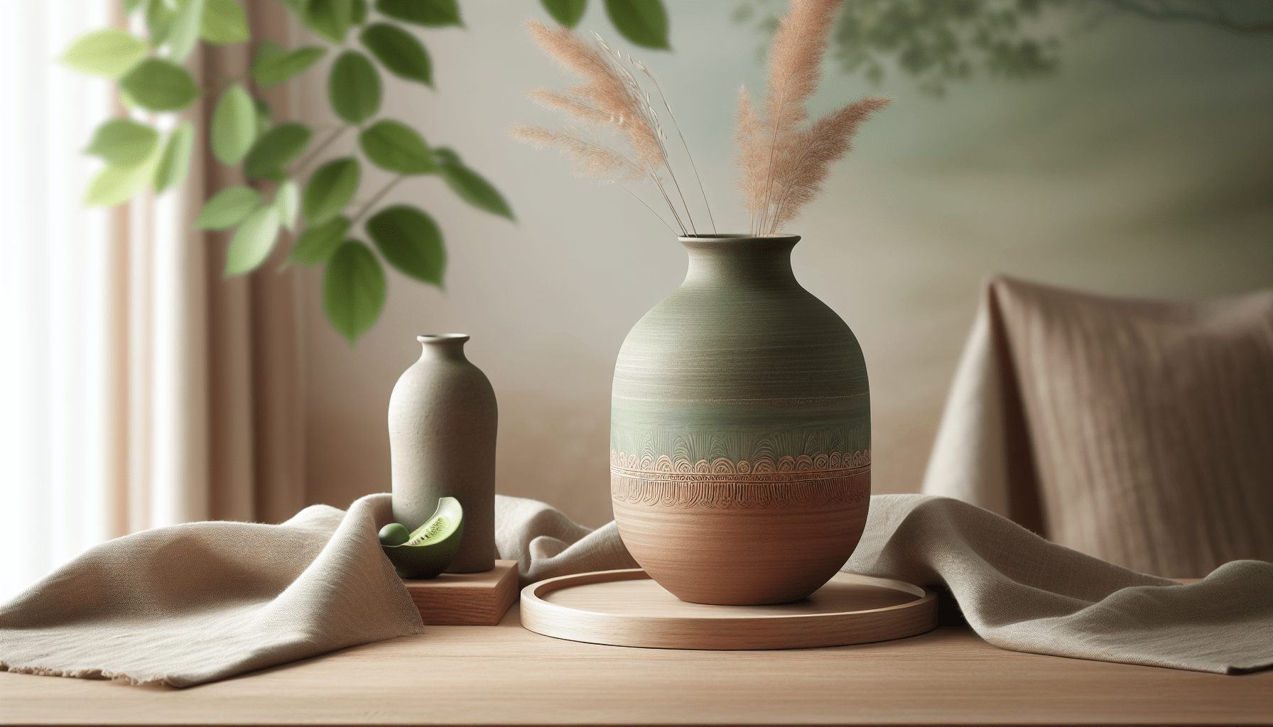
Small decorative items can make a significant impact. Choose vases, ceramics, or sculptures in your preferred hues. Placing these items on shelves or coffee tables provides visual interest without compromising the serene ambiance.
2. Art That Speaks
Art can serve as a perfect medium for adding color. Select artwork with vibrant accents that resonate with your chosen color palette. Keep the frames simple to maintain the Japandi aesthetic, emphasizing the artwork itself.
3. Layered Textures
Incorporating different textures in your accents can add dimension and interest. Consider mixing woven fabrics with smooth ceramic or glass finishes to create a layered but harmonious look.
4. Plant Life
Plants introduce both color and life into your home. Brightly colored planters can serve as accent pieces, and the lush greenery complements the earthy tones common in Japandi design.
Balancing Color with Natural Elements
Striking a balance between vibrant colors and the natural muted tones of Japandi design is essential for achieving a harmonious environment.
1. Use of Negative Space
Negative space is a design principle that highlights the area around your colorful accents, allowing them to breathe and stand out. Make sure that your pops of color don’t feel cramped by surrounding them with ample negative space.
2. Uniformity in Texture
To ensure color accents integrate smoothly into the overall design, maintain consistency in texture across your palette. For instance, a matte ceramic vase will resonate nicely with a raw wooden table, enhancing the cohesion of colors and materials.
Selecting Paint Colors That Adhere to Japandi Aesthetic
If you’re looking to paint a space or even a feature wall, consider how to choose a background color that supports any pops of contrasting colors.
1. Muted Tones
Stick with muted tones—soft grays, warm whites, or gentle taupes—these colors provide a calm backdrop that allows brighter accents to shine.
2. Accent Walls
If you wish to add a vibrant wall, consider using a color that is still muted but richer in tone, such as deep green or navy blue. These colors can serve as stunning backdrops for artwork or colorful furniture pieces.
3. Test Before Committing
Always sample paint colors in your space before committing to a color. Lighting can dramatically change the way a color looks on your walls, so it’s essential to see it at different times of the day.
Benefits of Keeping it Simple
Staying true to Japandi principles while incorporating color has its advantages. Here are a few reasons why keeping it simple can work wonders:
1. Timelessness
A design that emphasizes simplicity and natural beauty is timeless. By integrating color mindfully, you can ensure that your space evolves with your tastes without feeling outdated.
2. Easier to Change
If you decide to switch up your color scheme or if a trend catches your eye, changing out smaller accents is far easier than repainting an entire room or replacing larger furniture.
3. Enhances Focus
Japandi’s calming influence can create a space conducive to relaxation and focus. By adding carefully considered color accents, you enhance this effect, making your environment even more peaceful.
Incorporating Color in Different Rooms
Now that you understand the principles and have gathered inspiration, let’s look at how to apply these tips in different rooms throughout your home.
1. Living Room
In the living room, consider adopting brightly colored accessories like cushions or throws. A well-placed artwork can serve as an eye-catching focal point, contrasting beautifully with your neutral furniture.
2. Kitchen
For the kitchen, think of adding colorful dishware, a vibrant rug, or even colorful kitchen tools. These subtle touches can liven up the space without compromising the overall design.
3. Bedroom
In the bedroom, soft pastels can evoke a sense of calm. Accentuate with colorful bed linens or artistic wall hangings. Ensure that these colors are soothing to create a tranquil retreat.
4. Bathroom
In the bathroom, plants with colorful pots or decorative towels can introduce valuable color. Use matching shades that align with your overall color palette for a coordinated look.
Final Thoughts: Your Unique Space
Incorporating pops of color into your Japandi-inspired space doesn’t have to be daunting. Focus on simplicity, choose colors that resonate with nature, and ensure you’re harmonizing textures. As you work through your design, remember to prioritize what feels right for you—after all, it’s your unique space that deserves to reflect your personality and style. By following these principles, you can successfully create an environment that embraces the beautiful and serene aspects of Japandi while allowing your vibrant spirit to shine.