?Have you noticed how a room can make you feel calm, focused, or strangely restless without you being able to name exactly why? In this article you’ll learn how Japandi interiors — a blend of Japanese minimalism and Scandinavian warmth — shape emotional responses, and how muted palettes specifically influence mood and behavior in domestic and work environments.
What is Japandi?
Japandi is a hybrid aesthetic that combines Japanese and Scandinavian design traditions. You’ll recognize it by its emphasis on clean lines, functional forms, natural materials, and a restrained color palette that favors muted, earthy tones.
Origins and philosophy
Japandi grew out of two design philosophies that value simplicity, craftsmanship, and connection to nature. You’ll find that the approach is less about ornamentation and more about creating calm, purposeful spaces that support wellbeing.
Key aesthetic principles
The style emphasizes minimalism, thoughtful use of materials, and balance between functionality and beauty. You’ll notice careful composition, intentional negative space, and an emphasis on tactile surfaces that invite touch and slow moments.
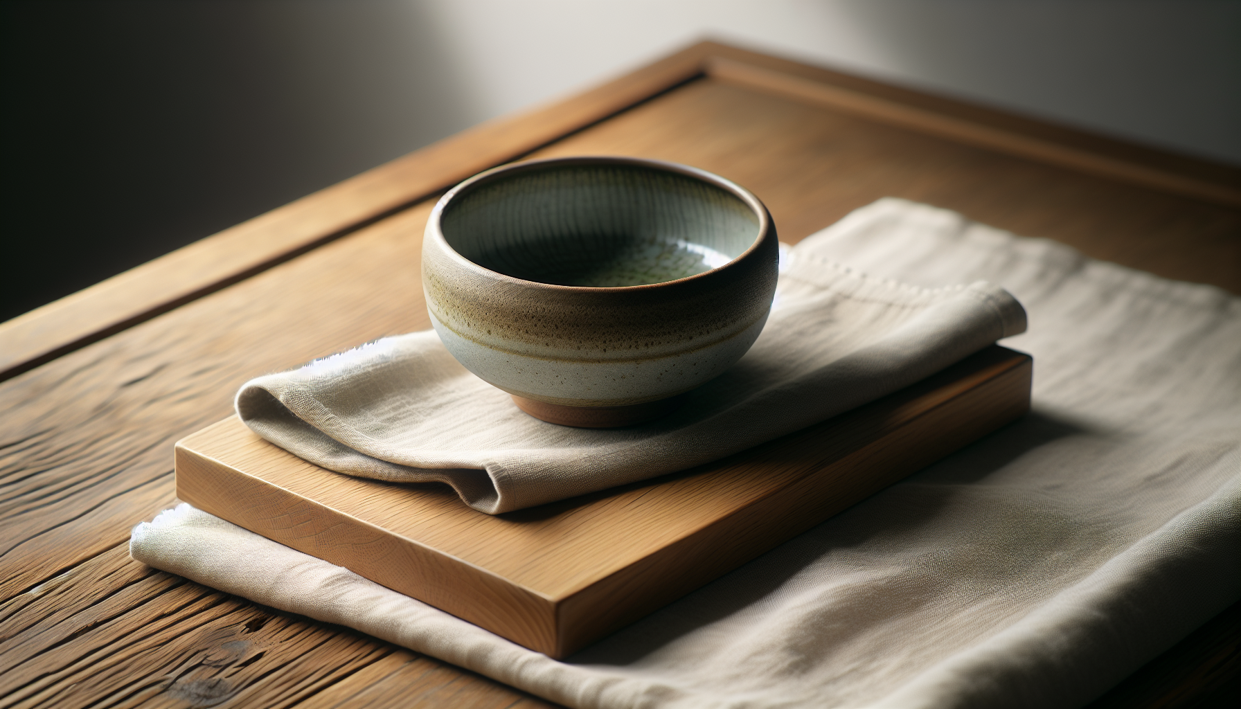
Muted Palettes: Definition and characteristics
Muted palettes are composed of desaturated colors — hues that have been softened by gray, white, or complementary tones. You’ll find these palettes comforting because they reduce visual noise and encourage the eye to rest rather than constantly seek contrast.
Why muted colors feel different
Muted colors generally lower arousal because they lack the intensity and brightness of saturated hues that can stimulate the nervous system. When you spend time in muted surroundings, your visual system performs less “work,” which often translates into a subjective sense of calm.
Common muted colors in Japandi
Typical colors include warm grays, soft taupes, low-saturation greens, charcoal, soft black-browns, and linen or off-white tones. You’ll often see these colors paired with light or mid-tone wood finishes and accents in matte ceramic or soft leather.
| Color Name | Common Hex Approximation | Emotional Association |
|---|---|---|
| Warm Gray | #B8B0A6 | Calm, neutrality |
| Soft Taupe | #C2B6A1 | Comfort, warmth |
| Muted Green | #9AA69A | Grounding, balance |
| Charcoal | #4C4A48 | Stability, sophistication |
| Linen White | #F2EFEA | Cleanliness, gentle clarity |
How interiors influence emotions (general)
Your environment affects your mood, cognition, and behavior through visual, tactile, and spatial cues. You’re influenced by color, light, proportion, texture, and the presence or absence of clutter, all of which modulate your physiological arousal and psychological state.
Environmental psychology basics
Environmental psychology studies how physical spaces affect emotional states and actions. You’ll learn that small changes in layout, color, or material can shift attention, stress levels, and social behavior.
Role of color in mood
Color acts as a nonverbal signal to your brain, influencing hormonal and autonomic responses tied to arousal and emotion. You’ll experience different degrees of calm, alertness, or stimulation depending on a palette’s hue, saturation, and brightness.
| Visual Element | How You Perceive It | Typical Emotional Outcome |
|---|---|---|
| High contrast color | Visually energizing | Increased alertness, sometimes agitation |
| Low contrast muted color | Visually calming | Reduced arousal, easier relaxation |
| Natural textures | Tactile comfort | Sense of warmth, security |
| Cluttered layout | Cognitive load | Stress, distraction |
| Balanced minimal layout | Cognitive clarity | Focus, ease of decision-making |
Emotional responses to Japandi interiors
You’ll typically find that Japandi interiors promote calm and clarity while still feeling warm and human. The style supports mindful living and creates opportunities for restful activities like reading, conversation, and concentration.
Calm and serenity
Muted tones and uncluttered surfaces lower sensory stimulation, which tends to reduce stress markers like heart rate and perceived tension. You’ll likely feel a steadier, gentler emotional baseline in such rooms.
Comfort and coziness (hygge/wabi-sabi overlap)
Japandi borrows hygge’s embrace of comfort and wabi-sabi’s appreciation for imperfection, making spaces feel intimate and lived-in without being messy. You’ll experience a domestic warmth that encourages slowing down and savoring small rituals, such as tea or reading.
Focus and clarity
The minimalism and neutral palette reduce competing visual stimuli, which helps your attention remain on the task or interaction at hand. You’ll find it easier to concentrate in a room where forms and colors don’t shout for attention.
Warmth without clutter
You’ll notice that the combination of warm wood tones and muted colors provides an inviting atmosphere without the need for excessive decorative elements. That restraint helps you feel grounded rather than overwhelmed by visual clutter.
Potential for melancholy or under-stimulation
While many people respond positively, muted environments can feel sobering or low-energy if they lack adequate light, texture, or personal touches. You’ll want to watch for sensations of listlessness or sadness and then add carefully chosen accents or brighter natural light to counterbalance those feelings.
Sensory elements beyond color
Color is important, but you also respond to texture, scale, sound, and scent, which are integral to the Japandi user experience. You’ll need to think holistically — how a surface feels, how furniture proportions interact with your movement, and how acoustics affect your sense of calm.
Natural materials and textures
Materials like warm wood, stone, linen, wool, and ceramic add tactile variation that invites touch and visual interest without loud color. You’ll feel more connected and comforted when surfaces have subtle irregularities that provide sensory richness.
Lighting and its emotional effects
Natural light softens muted palettes and keeps them from feeling flat, while layered artificial lighting allows you to tune the mood for different activities. You’ll want warm, dimmable light for relaxation and brighter, cooler tones for tasks that need alertness.
Minimalism and spatial balance
Negative space and negative volume are tools for emotional management in Japandi design; they let you breathe mentally and physically. You’ll find that open sightlines and careful furniture placement reduce cognitive load and make it easier to navigate your day.
| Element | Design Strategy | Emotional Effect for You |
|---|---|---|
| Wood grain | Use varied tones & visible grain | Warmth, organic connection |
| Soft textiles | Layer rugs, throws, cushions | Tactile comfort, coziness |
| Light layering | Ambient + task + accent lights | Flexibility, controlled mood |
| Acoustic dampening | Rugs, textiles, soft furniture | Reduced stress, better conversation |
| Plants | Select minimalist, low-maintenance greenery | Calm, perceived air quality |
Evidence: research and studies
Design research shows links between natural elements, soft color, and improved wellbeing, though effects vary by context and individual differences. You’ll want to treat general findings as guidelines and test what works best in your own home.
Studies on color and mood
Research consistently finds that highly saturated colors increase arousal and attention, while desaturated colors reduce autonomic arousal and support relaxation. You’ll notice that muted hues create a calmer baseline mood, but the specific impact can depend on brightness, context, and personal associations.
Biophilia, natural materials, and wellbeing
Studies on biophilic design indicate that natural materials, views of nature, and organic forms tend to lower stress and improve cognitive performance. You’ll benefit from materials that suggest nature — wood, stone, and plants — because they provide subtle psychological comfort.
Minimalism and mental load
Research into clutter and minimalism suggests that visible clutter increases cortisol and impairs working memory, while simplified environments enhance cognitive control. You’ll likely feel less mentally taxed in a space where storage and organization reduce visual distraction.
Cultural and individual differences
Your reaction to Japandi interiors will be shaped by cultural norms and personal memories. Colors and design cues carry different meanings across cultures, so a muted palette that feels peaceful to you might feel empty or cold to someone else.
Cultural associations
In some cultures, muted restraint is associated with dignity and sophistication; in others, brighter colors symbolize energy and celebration. You’ll want to consider cultural context when designing shared spaces or when you aim to create a specific social atmosphere.
Personality and personal history
Your temperament, sensory sensitivity, and past experiences shape how you respond to design. If you’re highly sensitive, you’ll likely prefer softer tones and more tactile surfaces; if you’re extroverted or seek stimulation, you may want more contrasting elements or personal artifacts.
Age, gender, and life stage
Different life stages bring different functional needs and emotional priorities — for example, families with small children may prioritize durability and warmth, while single professionals might emphasize calm and focus. You’ll adapt the Japandi approach to your practical needs, balancing safety, maintenance, and aesthetic aims.
Practical implementation: designing Japandi spaces for emotional impact
When you design a Japandi room with emotional outcomes in mind, start with function, then choose a restrained palette and layer materials. You’ll be more successful if you test color samples in different lights and build texture gradually.
Choosing a muted Japandi palette
Start with a neutral base (linen white, warm gray) and layer mid-tone woods and a single muted accent color for depth. You’ll avoid boredom by varying undertones (warm vs cool grays, beige vs olive) rather than adding saturated colors.
Balancing warmth and coolness
Pair warm woods and taupes with cool charcoal or muted greens to create visual balance and prevent the room from skewing too warm or too cold. You’ll feel more comfortable when temperature in color and physical temperature (lighting warmth, sunlight) are in harmony.
Textures and layering for comfort
Introduce textiles — wool rugs, linen curtains, cotton throws — in complementary muted tones to create tactile richness. You’ll rely on texture to provide emotional warmth without resorting to bright color.
Lighting strategy for mood
Plan for layered lighting: ambient overhead, task lights where you read or work, and accent lights to highlight objects or texture. You’ll want dimmers and warm color temperatures to give you control over the room’s emotional tone.
Furniture and layout tips
Choose low-profile furniture with simple silhouettes and high-quality finishes that age gracefully. You’ll arrange pieces to create conversational groupings and clear pathways, keeping sightlines open to reduce cognitive friction.
| Design Decision | Practical Tip | Emotional Result for You |
|---|---|---|
| Base wall color | Use off-white or warm gray | Neutral backdrop, reduces eye strain |
| Accent color | One muted green or charcoal | Adds depth without overwhelm |
| Flooring | Light-to-mid wood | Warmth, natural connection |
| Textiles | Natural fibers, layered | Tactile comfort, acoustic dampening |
| Lighting | Dimmers + warm bulbs | Mood control, cozy evenings |
Sample muted Japandi palettes
These palettes are starting points; you’ll adjust undertones and saturation to suit your light and personality.
| Palette Name | Colors (Suggested Uses) | Emotional Intent |
|---|---|---|
| Linen & Oak | Linen White (#F2EFEA), Oak Wood, Warm Gray (#B8B0A6), Muted Olive (#9AA69A) | Calm, grounded, natural |
| Stone & Charcoal | Soft Taupe (#C2B6A1), Mid-Gray, Charcoal (#4C4A48), Beige Linen | Sophisticated tranquility |
| Sea Grass | Soft Sand, Driftwood, Muted Teal (#8EA7A1), Ash Gray | Gentle freshness, clarity |
You’ll test these on large swatches and live with them for several days before committing.
Room-specific guidance
Each room has different functional and emotional requirements; you’ll tailor your Japandi approach accordingly for optimal effect.
Living room
In the living room you’ll balance social warmth with restful surfaces — a warm wood coffee table, a textured rug, and a neutral sofa create an inviting scene. You’ll use layered lighting to support conversation in the evening and brighter settings for daytime activities.
Bedroom
The bedroom benefits from the most subdued palette and the softest textures to support sleep and relaxation. You’ll choose cool or neutral walls, warm wood furniture, and layered bedding in linen and cotton.
Home office
For a home office you’ll prioritize focus and ergonomics while maintaining warmth to prevent a sterile feel. You’ll use a muted accent to anchor the workspace and ensure strong task lighting to maintain alertness during work sessions.
Kitchen and dining
In kitchens and dining areas you’ll favor durable, tactile materials (stone counters, wood cabinetry) and a restrained palette that highlights craftsmanship. You’ll aim for good daylighting and surface finishes that are easy to clean while still being visually gentle.
Maintenance and lifestyle considerations
Muted palettes may show dust or wear differently than high-contrast schemes, so you’ll select materials that are durable and forgiving. Regular upkeep is part of ensuring the emotional benefits of calm spaces continue over time.
Cleaning and wear
Light fabrics and pale surfaces will need more frequent cleaning, while mid-tone woods and textured surfaces tend to be more forgiving. You’ll plan storage solutions to keep clutter stashed away easily.
Rotating elements
Rotate soft furnishings or a single accent to prevent stagnation and keep the space feeling alive. You’ll change throws, plants, or small objects seasonally rather than redoing the entire room.
Potential downsides and how to mitigate
Japandi’s restraint can sometimes read as austere or under-stimulating if executed without enough warmth or personal reference. You’ll mitigate this by adding curated personal items, varying textures, and introducing plants or subtle art.
Avoiding monotony
If your room feels monotonous, consider introducing a tactile or tonal contrast — a darker wooden sideboard, a patterned neutral rug, or an organic ceramic piece. You’ll restore interest without abandoning the muted aesthetic.
Preventing coldness
Coldness often results from poor lighting or too much cool undertone; you’ll correct it with warmer bulbs, warmer-leaning gray paints, or a few brass or wood accents. You’ll test changes in both daylight and artificial light to ensure consistent warmth.
Measuring your emotional response
To understand how Japandi affects you, you’ll track mood, behavior, and performance over time using simple methods. Objective measures and subjective reports together give the clearest picture.
Journaling and self-report
Keep a daily journal for a few weeks, noting mood, sleep quality, focus, and social behavior in your space. You’ll look for patterns tied to lighting, time of day, or activities to refine your design.
Behavioral and physiological measures
If you want a more objective read, monitor indicators like sleep duration, time spent on task, or heart rate variability during rest. You’ll see whether the environment reduces nighttime awakenings or improves concentration during work.
Case studies and hypothetical examples
Concrete examples help you visualize how Japandi affects different people in different contexts. These scenarios show how palette, texture, and layout changes influence mood and behavior.
Case: The overstressed professional
You live in a small apartment and were constantly distracted; after switching to a Japandi palette of warm gray walls, oak furniture, and linen textiles, your evenings become calmer and you report better focus during short work sessions. You’ll find that the reduction in visual clutter made it easier to switch off after work.
Case: The creative parent
You need both function and softness; using muted green as an accent, washable wool rugs, and child-friendly light wood helped maintain a peaceful home while accommodating activity. You’ll notice family interactions feel less tense and daily routines flow more smoothly.
Case: The remote worker seeking focus
You converted a corner into a home office with charcoal accents, a mid-tone wooden desk, and layered lighting; your productivity increased and you felt less mental fatigue. You’ll attribute the improvement to fewer visual distractions and a clearer separation between work and leisure zones.
Frequently asked questions
You’ll often have practical and emotional concerns when shifting to Japandi; these FAQs address the most common ones with straightforward guidance.
Q: Will a muted palette make my home look boring?
Muted does not mean boring — it means subtlety and depth. You’ll create visual interest through texture, pattern, and thoughtful contrast rather than relying on bright color.
Q: How do I introduce Japandi if I rent or have limited budget?
Start small: swap textiles, add a rug, paint an accent wall in a muted tone, and layer natural materials through accessories. You’ll get a big emotional return from inexpensive changes like lighting and textiles.
Q: Can Japandi work in a small, dark apartment?
Yes, but you’ll need to maximize light and choose slightly warmer or brighter base tones to avoid a gloomy feel. You’ll use mirrors, reflective surfaces, and layered lighting to amplify the available light.
Q: How do I keep a muted space lively for guests?
Rotate in a few personality items — artwork, ceramic pieces, or plants — that reflect your identity without overpowering the palette. You’ll switch accent objects seasonally to refresh the space.
Conclusion
Japandi interiors and muted palettes tend to nudge you toward calm, focus, and tactile comfort by reducing visual noise and emphasizing natural materials. You’ll get the most benefit by tailoring tone, texture, lighting, and layout to your personal needs, testing changes, and paying attention to how your mood and behavior respond over time.
If you’re planning a change, try one small intervention this week — maybe a new linen throw, a warm-toned lamp, or a muted accent cushion — and note how your day feels afterward. You’ll be surprised by how subtle shifts can create meaningful improvements in comfort and wellbeing.