What do you envision when you think about a Japandi interior? Is it the serene blend of Japanese minimalism and Scandinavian functionality? If you’re considering a Japandi-style home, you’ll want to think about the accent colors that will elevate your space while maintaining that harmonious vibe. In this article, let’s dive into the world of accent colors that perfectly complement the Japandi aesthetic.
The Essence of Japandi Design
Japandi is all about balance and harmony. It brings together the best of two distinct styles: the sleek minimalism of Japanese design and the warmth and coziness of Scandinavian interiors. This style encourages the use of natural materials, muted tones, and a focus on craftsmanship. When you think about incorporating accent colors, your choices will enhance this foundational philosophy.
Understanding Color Theory
Before you pick up a paintbrush or start searching for decor items, it’s essential to understand how colors affect the overall mood of your space. The colors you choose can create a sense of calmness, energy, or warmth. Basic color theory tells us that colors can be divided into warm, cool, and neutral tones.
- Warm Colors: Reds, oranges, and yellows that evoke warmth and energy.
- Cool Colors: Blues, greens, and purples that promote calmness and relaxation.
- Neutral Colors: Whites, grays, and beiges that balance out other colors and provide a serene backdrop.
In a Japandi interior, your chosen accent colors will work with a primarily neutral palette, allowing you to maintain a sense of openness and tranquility while introducing personality and vibrancy.
Best Accent Colors for a Japandi Interior
Let’s look at some of the best accent colors you can incorporate into your Japandi space. Each color will not only elevate your design but also complement the characteristic features of Japandi aesthetics.
1. Soft Greens
Soft greens evoke a sense of nature and tranquility, aligning perfectly with the Japandi ethos. Think of shades like sage, olive, or moss.
-
Why Choose Soft Greens?: These colors can create a serene atmosphere, promoting relaxation. They mimic the natural environment, offering a refreshing contrast to wood and natural fibers often found in Japandi interiors.
-
How to Use Soft Greens: Consider using soft green cushions, a throw blanket, or wall art to add a touch of nature without overwhelming the space.
2. Dusty Blues
Dusty blues bring in calmness, reminiscent of the sky and sea, making them a great addition to a Japandi home.
-
Why Choose Dusty Blues?: This color pairs beautifully with neutrals and creates a soothing backdrop. It enhances the lightness in a room while introducing a touch of color that isn’t overpowering.
-
How to Use Dusty Blues: Incorporate dusty blue through decorative vases, ceramics, or even a statement piece of furniture.
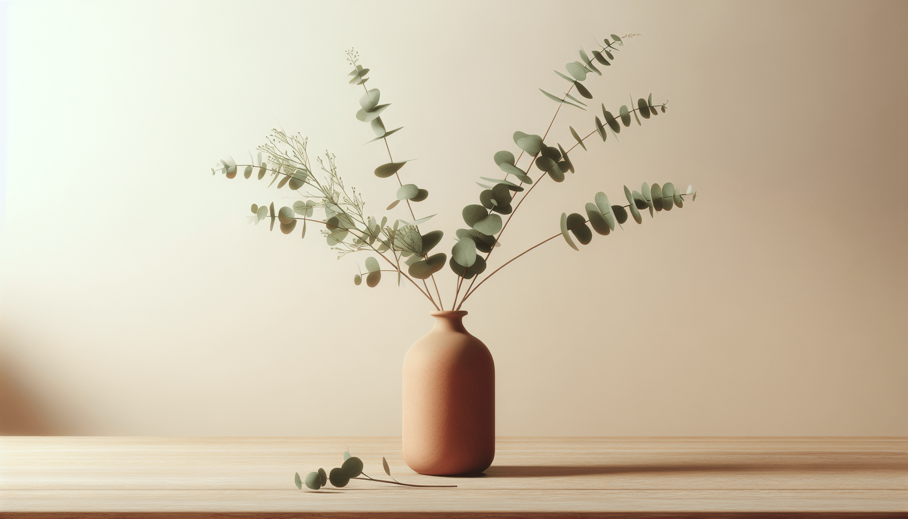
3. Warm Terracotta
Adding warm terracotta tones introduces an earthy, grounding element to your interior.
-
Why Choose Warm Terracotta?: The rich, warm hues can add depth and warmth, contrasting nicely with the lighter colors typical in Japandi design.
-
How to Use Warm Terracotta: Think about terracotta pots for plants or a feature wall painted in this inviting shade.
4. Muted Mustard
Muted mustard can bring cheerful warmth to your space while keeping the overall tone subdued.
-
Why Choose Muted Mustard?: It works well with both Scandinavian and Japanese aesthetics, giving a nod to the golden hues of natural wood while adding vibrancy.
-
How to Use Muted Mustard: Add this tone through cushions, rugs, or small decorative items to spice up an otherwise neutral palette.
5. Charcoal Grey
Charcoal grey is a sophisticated choice that offers depth without feeling heavy.
-
Why Choose Charcoal Grey?: It can act as a perfect backdrop, allowing lighter and softer accent colors to pop without overwhelming the space.
-
How to Use Charcoal Grey: Consider using it on accent walls, furniture pieces, or even in textiles like curtains or upholstery.
6. Soft Blush Pink
Soft blush pink introduces a gentle touch of warmth that pairs beautifully with neutral colors.
-
Why Choose Soft Blush Pink?: This subtle color can create a soothing atmosphere, making spaces feel inviting and serene.
-
How to Use Soft Blush Pink: Look for decorative pillows, artwork, or even in a piece of furniture to weave this gentle color throughout your space.
Creating a Balanced Palette
When you think about incorporating these accent colors, the key is balance. Here’s a simple formula you can follow to maintain that harmony:
| Color Type | Proportion |
|---|---|
| Neutral Colors | 60% (walls, large furniture) |
| Main Accent Color | 30% (cushions, rugs, secondary furniture) |
| Additional Accents | 10% (art, decorative items) |
By adhering to this guideline, you can create a cohesive look that embodies the Japandi spirit while allowing your personality to shine through.
Incorporating Textures
In addition to color, texture plays a vital role in your Japandi interior. Mixing textures can enrich your space, making it feel layered and inviting.
Natural Materials
Using natural materials like wood, stone, and textiles will add warmth and depth. Consider wooden furniture, rattan baskets, or linen curtains.
Textured Fabrics
When choosing fabrics, look for those with texture—think woven, knitted, or embroidered pieces. These can add visual interest while adhering to the Japandi philosophy of simplicity and functionality.
Lighting Considerations
Lighting can dramatically influence how your chosen colors are perceived.
Natural Light
Whenever possible, maximize natural light in your space. Try to keep window treatments minimal to allow as much sunlight as possible during the day. This will enhance the colors in your décor, making your space feel brighter and more open.
Accent Lighting
In addition to natural lighting, consider incorporating accent lighting. Warm, soft lighting can soften colors and create a cozy atmosphere. Use floor lamps, table lamps, or light fixtures that highlight your chosen accent colors.
Popular Decor Items to Reflect Accent Colors
Here’s a quick overview of popular decor items that can help you bring your chosen accent colors into your Japandi space:
| Decor Item | Color Ideas | Usage |
|---|---|---|
| Cushions | Soft greens, dusty blues | On sofas, chairs, or beds |
| Rugs | Muted mustard, terracotta | Under coffee tables or in dining areas |
| Wall Art | Soft blush pink | Gallery walls or above furniture |
| Baskets | Charcoal grey | Storage solutions or decorative accents |
| Ceramic Vases | Warm terracotta | On shelves or dining tables |
Seasonal Changes
As you embrace the Japandi aesthetic, don’t forget that colors can evolve with the seasons. You can rotate your accent colors or items to reflect seasonal changes. For example:
- Spring/Summer: Introduce brighter, lighter colors like soft pastels or vibrant greens.
- Fall/Winter: Incorporate deeper tones like warm terracotta or muted mustard to create a cozy atmosphere.
Conclusion
As you think about accent colors for your Japandi interior, remember that the key is to create a space that feels balanced and harmonious. Play around with soft greens, dusty blues, warm terracotta, muted mustard, charcoal grey, and soft blush pink to see how they resonate with your personal style.
By blending these accent colors with natural materials and thoughtful textures, you can transform your space into a serene retreat that beautifully reflects the very essence of Japandi design. Ultimately, your home should be a reflection of you—a space that not only looks great but feels like a haven. Happy decorating!