What do you think about the blend of Japanese minimalism and Scandinavian functionality? This fusion, known as Japandi, not only creates stunning interiors but also provides a calm and harmonious atmosphere that many of us crave in our homes. One crucial element in achieving that harmony is the color palette. Choosing the right colors can significantly affect the mood and style of a Japandi space. Let’s take a closer look at some of the best color palettes that work wonders in Japandi interiors.
Understanding Japandi Style
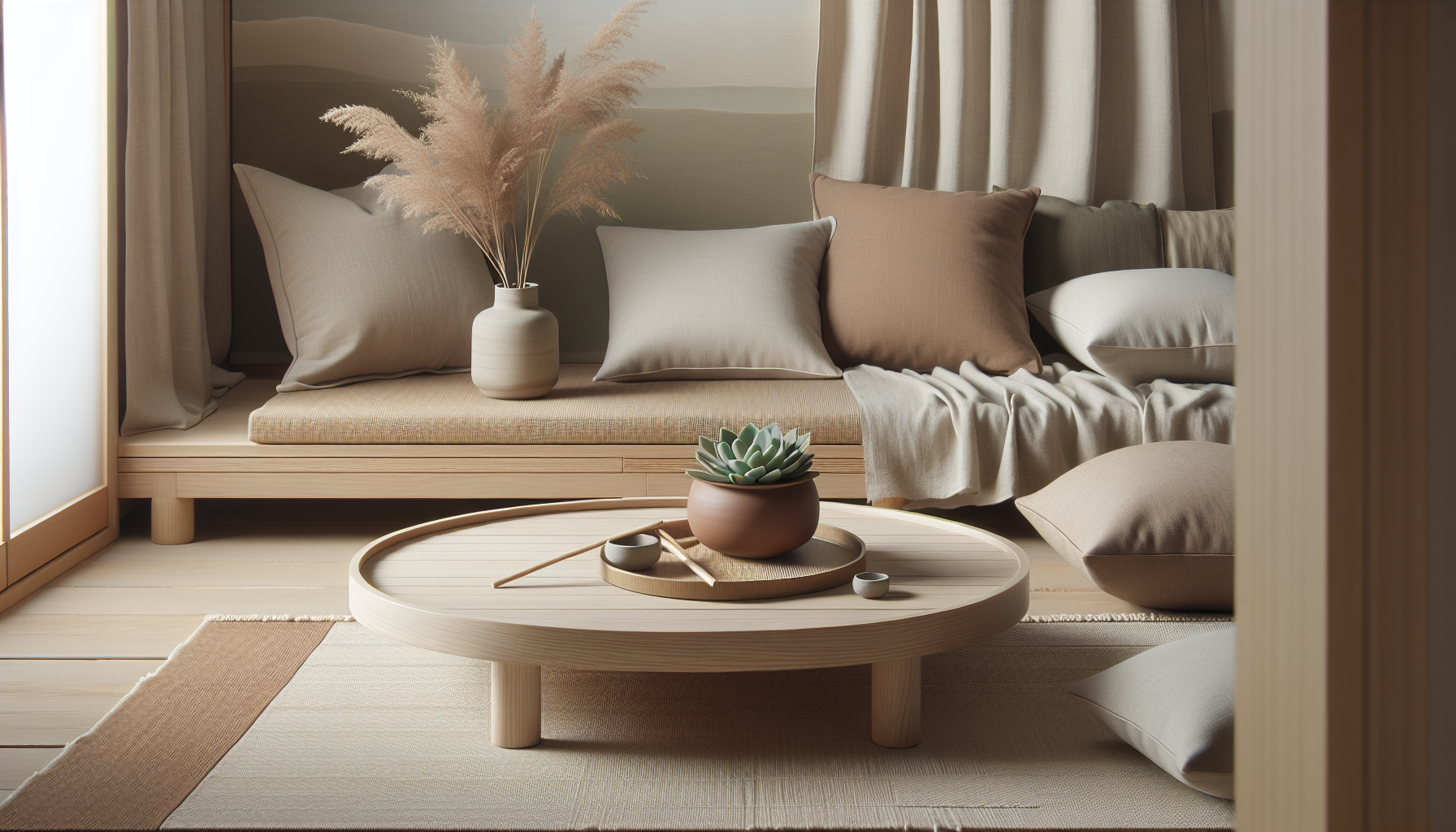
Before diving into color palettes, it’s helpful to grasp what Japandi style encompasses. Japandi marries the simplicity of Japanese design, which emphasizes natural materials, clean lines, and a sense of space, with Scandinavian aesthetics that focus on functionality and comfort. The result? Spaces that are not only beautiful but also deeply functional and comforting.
In Japandi design, the use of color tends to be restrained and deliberate. The emphasis lies on creating a soothing, serene environment. Therefore, selecting a color palette is vital in achieving the desired essence of this style.
Key Characteristics of Color in Japandi Interiors
When you think of color in Japandi interiors, it’s essential to consider several key characteristics. These traits guide your color choices for a cohesive and well-designed space.
1. Neutrality
Neutral hues form the foundation of Japandi style. They provide a calming backdrop and allow for layered textures and natural materials to shine. Shades like soft whites, taupes, and grays are commonly used.
2. Earthy Tones
Incorporating earthy tones into your color palette is an excellent way to connect with nature, a fundamental aspect of both Japanese and Scandinavian designs. Think of warm browns, muted greens, and soft terracotta shades.
3. Accent Colors
While neutrals and earthy tones dominate, adding accent colors can inject personality into your space. These colors should be chosen carefully; they are usually drawn from nature and should complement the overall palette without overwhelming it.
Classic Japandi Color Palettes
Let’s look at some classic color palettes that embody the Japandi spirit.
1. Monochromatic Neutrals
A monochromatic neutral palette focuses exclusively on different shades of one color. In this case, using varying shades of beige can create a soothing and serene environment.
| Color Shade | HEX Code |
|---|---|
| Light Beige | #E1D9D1 |
| Medium Beige | #C5B5A5 |
| Dark Beige | #A89A84 |
| Off-White | #F5F5F5 |
Incorporating different textures along with these hues enhances depth, making the space more inviting.
2. Earthy Greens and Browns
These colors evoke a sense of tranquility and connection to nature. An earthy green paired with warm browns can create a nurturing atmosphere.
| Color Shade | HEX Code |
|---|---|
| Sage Green | #A8B8A0 |
| Olive Green | #C2C66D |
| Warm Brown | #8B5A2B |
| Cream | #F8F4E3 |
Using plants and natural materials can seamlessly bring this palette to life.
3. Soft Grays and Whites
A soft gray and white palette provides a clean, minimalist feel while maintaining warmth. This combination is also incredibly versatile.
| Color Shade | HEX Code |
|---|---|
| Light Gray | #EAE9E5 |
| Medium Gray | #B0B3B7 |
| White | #FFFFFF |
| Off-White | #F9F9F9 |
You can enhance these tones with wooden elements or textiles to add coziness.
4. Deep Blues and Warm Woods
This palette offers sophistication and tranquility, reminiscent of serene lakes. Pairing deep blues with warm woods can create a moody yet inviting ambiance.
| Color Shade | HEX Code |
|---|---|
| Deep Navy Blue | #2C3E50 |
| Slate Gray | #7D7F8A |
| Warm Walnut | #5D4B3A |
| Cream | #FCF6F0 |
This palette works beautifully in living spaces, invoking a sense of calmness.
Tips for Incorporating Color Palettes into Japandi Interiors
Knowing your color palette is one thing; incorporating it effectively into your space is another. Here are some tips to guide you:
1. Focus on Textures
Texture plays a crucial role in Japandi interiors. When using a neutral color palette, layer different textures—from smooth ceramics to soft fabrics—to add visual interest. For instance, pairing a linen sofa with a textured wool throw can create a cozy but sophisticated atmosphere.
2. Use Natural Materials
Incorporate natural materials to enhance your color palette. For instance, wooden furniture can add warmth to a cool-toned space, while stone accents can enrich earthy palettes.
3. Create Contrast
Whether you’ve decided on a monochromatic scheme or a more colorful approach, don’t shy away from contrast. The juxtaposition of dark and light can elevate your space. Use contrasting colors for accessories and artwork to draw attention and create focal points.
4. Pay Attention to Lighting
Lighting can dramatically alter how colors appear in your space. Natural light enhances softer hues, while cooler light can add a stark quality to your colors. Consider how light shifts at different times of the day and adjust your palette accordingly.
5. Embrace the ‘Wabi-Sabi’ Philosophy
The Japanese concept of Wabi-Sabi celebrates imperfection and the beauty of natural processes. Integrating this philosophy into your color choices means accepting hues as they naturally evolve and interact over time.
Accessories and Details to Consider
Adding accessories and details is essential for completing your Japandi look. Here are some choices that work beautifully with your color palette:
1. Natural Fabrics
Use textiles made from linen, cotton, or wool to enhance warmth and comfort. Select fabrics in your desired color palette, focusing on textural contrast to enrich the visual experience.
2. Ceramics and Pottery
Ceramic items in earthy tones can add character and warmth. Look for pots, vases, or dishware that align with your palette to ensure coherence.
3. Natural Artwork
Wall art can bring your color palette together. Opt for pieces that feature the colors you’ve chosen or embed natural scenery that resonates with your selected hues.
Final Thoughts: Personalization
Choosing a color palette for your Japandi interior isn’t strictly about adhering to trends or rules. It’s your space, and it should reflect your personality and style.
Experiment with various colors and combinations until you find a look that feels just right for you. Whether you lean towards a neutral palette, use vibrant accents, or embrace earthy tones, the key is balance and harmony. Remember, designing your space is a journey, and your color choices are important chapters in that story. So take your time, have fun with it, and enjoy the process of making your home uniquely yours.