Which emotional colors do you instinctively reach for when you want your space to feel calm, warm, and unmistakably refined?
Emotional Colors That Define Japandi Interiors
What is Japandi and why do colors matter?
Japandi is a hybrid design style that fuses Japanese minimalism with Scandinavian warmth and functionality. You’ll notice the pairing of clean lines and purposeful simplicity with cozy textures and human-centered comforts. Color is one of the most powerful tools you have to express the philosophy behind Japandi: restraint, harmony, and emotional clarity.
Colors aren’t just surface decoration; they shape how you feel and how you live in a room. In Japandi, color choices reinforce the values of balance, naturalness, and quiet luxury. You’ll use a limited, curated palette to produce spaces that feel intentional and emotionally layered without being busy.
The emotional language of color in Japandi
Colors carry emotional associations that people respond to, often subconsciously. In Japandi you’ll favor shades that support a sense of calm, groundedness, and understated joy. You’ll use color to highlight craftsmanship and texture rather than to dominate a room.
Think of color as a mood-setting tool. Soft, desaturated hues soothe; warm neutrals create comfort; deep accents offer depth and contemplation. When you choose colors for a Japandi interior, you’re composing a visual and tactile experience that matches the lifestyle you want: mindful, practical, and quietly elegant.
Core emotional color categories for Japandi
Below are the principal emotional color categories that define Japandi interiors. Each group carries a specific kind of feeling that you can apply to rooms and objects.
- Neutrals for serenity and canvas
- Warm wood tones for comfort and connection
- Muted natural colors for subtle vitality
- Deep accent colors for focus and sophistication
- Soft pastels for gentle uplift
Use these groups as a toolkit. You’ll mix and layer them in restrained ways to create depth without clutter.
Neutrals: calm, clarity, and flexibility
Neutrals form the backbone of Japandi interiors. You’ll choose warm beiges, soft grays, and creamy off-whites that feel organic rather than sterile. These tones act like a calm canvas, letting textures and form take center stage.
Neutrals help unify rooms and provide visual rest. When you saturate a space in neutrals, your eye rests more easily, and objects with craftsmanship—wood furniture, woven textiles—become focal points.
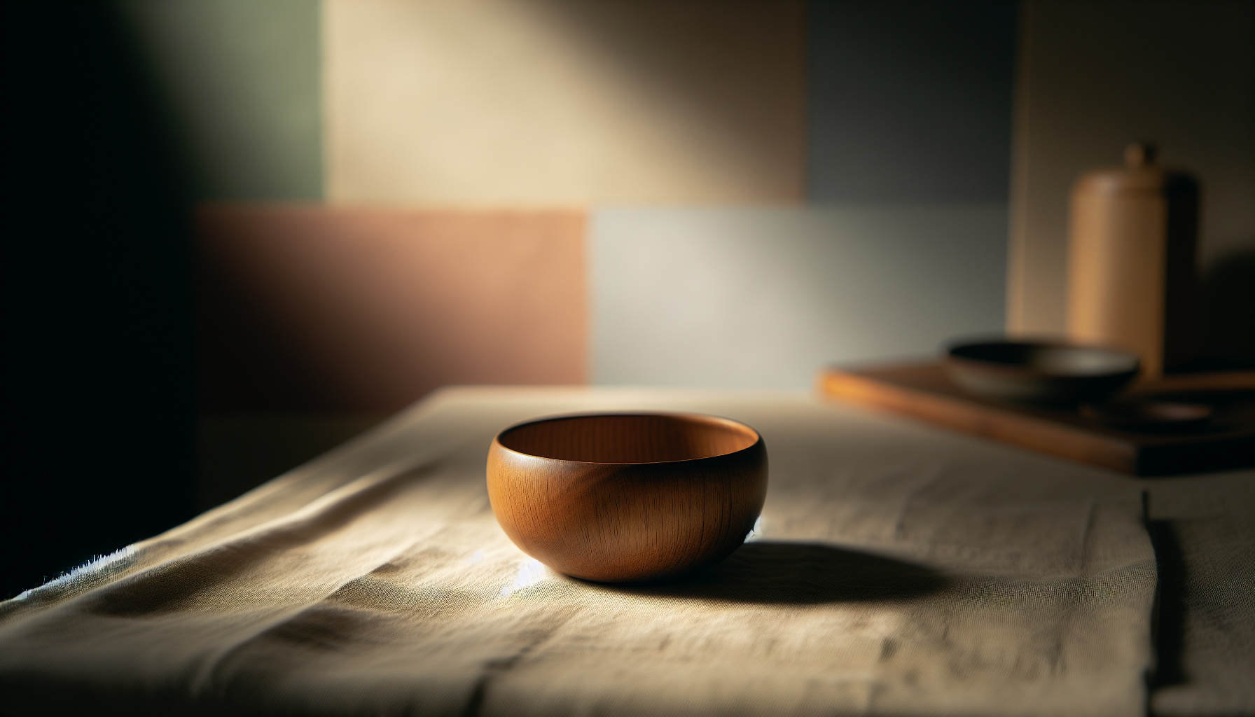
Warm wood tones: grounded comfort and connection
Wood tones are emotional anchors in Japandi. You’ll find them in furniture, floors, and accents. Think blond oak, warm walnut, and caramel teak. These hues give the space a sense of rootedness and tactile warmth.
Wood also carries cultural resonance—Japanese and Scandinavian traditions both value natural materials. In Japandi, wood is often left with light finishes or gentle oils that preserve grain and texture, strengthening the emotional link to nature.
Muted natural colors: subtle vitality and balance
Muted greens, dusty blues, and soft terracotta nod to the natural world without being loud. You’ll use these hues sparingly to introduce life and balance. They hint at landscapes—moss, sky, clay—without mimicking them.
These colors bring a quiet vitality. They’re good for textiles, ceramics, and accent walls where you want a gentle contrast with the neutral backdrop.
Deep accent colors: focus, depth, and contemplation
Deep, moody shades like charcoal, deep indigo, and forest green add emotional depth. You’ll use them as focal accents to ground a room visually and emotionally. They can make corners feel intimate or direct attention to a crafted object.
In Japandi, deep accents are applied in moderation—on cabinetry, a rug, or an art piece—so they generate contrast without overpowering the serene palette.
Soft pastels: gentle uplift and sensory calm
Pale blush, muted peach, and washed lilac can introduce a gentle warmth or softness. You’ll find them primarily in textiles—throw pillows, cushions, bedding—where they provide delicate contrast and comfort.
Pastels in Japandi are desaturated and slightly earthy; they calm rather than excite and help you feel nurtured in the space.
Color palette examples with emotional cues
Here are practical color palettes you can use. Each palette pairs hues deliberately to create a specific emotional tone. The hex codes give you an actionable reference for paint, fabric, or digital mood boards.
| Palette Name | Main Mood | Core colors (sample hex) | Where to use |
|---|---|---|---|
| Serene Canvas | Tranquil, uncluttered | Soft Linen #EDE7E0, Warm Taupe #BFAF9A, Pale Ash #CFCFC7 | Walls, large upholstery, rugs |
| Nordic Hearth | Warm, inviting | Blond Oak #D8BCA6, Caramel #A3784F, Cream #F3EDE6 | Wood furniture, flooring, cabinetry |
| Moss Garden | Grounded, restorative | Muted Moss #8A9A76, Stone Gray #9EA3A1, Soft Sand #DDD6C9 | Accent wall, textiles, planters |
| Quiet Depth | Contemplative, refined | Deep Indigo #243447, Warm Slate #7C7F84, Soft Oat #E8E2D8 | Cabinets, feature wall, art frames |
| Gentle Blossom | Nurturing, subtle joy | Dusty Rose #D8B6B3, Warm Beige #CDB9A7, Off-White #F6F3F0 | Pillows, bed linens, ceramics |
Use these palettes as starting points. You’ll adjust saturation and darkness to fit your light, room size, and personal preference.
How light affects emotional colors in Japandi
Natural and artificial light dramatically change how colors read. You’ll need to assess lighting at different times of day to be confident in your palette.
- North-facing rooms: Colors read cooler and more muted. Warm up neutrals slightly or incorporate more warm wood to avoid a chilly feel.
- South-facing rooms: Colors appear brighter and warmer. Deep accents gain richness; muted colors may look livelier.
- Artificial light: LED and incandescent bulbs have different color temperatures. Choose bulbs with warm light (2700–3000K) to complement Japandi’s cozy, natural palette.
Test paint swatches on walls and look at them morning, afternoon, and evening before committing. Fabric samples held in the room will also show how they shift with light and texture.
Room-by-room emotional color strategies
Each room plays a different role in your life, so you’ll tailor color strategies according to function and the mood you want to create.
Living room: sociable calm and layered warmth
Your living room should invite you to sit and unwind while still feeling elegant. You’ll anchor the room with a neutral wall and a mid-tone wood floor or furniture. Add a deep accent (charcoal or indigo) in a rug or console to create visual focus and intimacy.
Layer with textiles in muted greens or terracottas to add life without excitement. Keep contrast modest so conversation and relaxation remain the priorities.
Bedroom: restorative softness and subtle luxury
In the bedroom you’ll prioritize calm and tactile comfort. Soft neutral walls, warm wood headboards, and bedding in desaturated pastels or warm beiges create a restful cocoon. Use deep accents sparingly—perhaps a low bench or a textured blanket—to ground the space.
Lighting should be warm and adjustable to support sleep routines. The color scheme should minimize visual stimulation while still feeling curated.
Kitchen: practical clarity with human warmth
Kitchens require practical finishes and easy care. A Japandi kitchen often uses warm wood cabinets or open shelving paired with soft neutral counters. You can choose a muted blue or green for lower cabinets to add subtle personality while keeping upper surfaces light.
Color in the kitchen should feel clean and durable. Consider ceramic backsplashes in natural tones and metal finishes in warm brass or matte black for accents.
Bathroom: pure calm and tactile refreshment
Bathrooms benefit from lighter palettes that feel pristine and soothing. Soft off-white tiles, stone-toned counters, and warm wood vanities create a spa-like atmosphere. Introduce muted greens or pale blues in towels and accessories for a hint of nature.
Keep grout and finishes consistent to maintain a restrained, high-quality look.
Workspace: focused neutrality with gentle stimulation
A Japandi workspace should help you concentrate without feeling rigid. Use a calm neutral backdrop with a deeper accent on a single wall or shelving unit to create a sense of enclosure and focus. Textured materials, like a woven rug or wooden desk, make the area feel human and comfortable.
Small pops of muted color—sage, dusty blue—can stimulate creativity without becoming distracting.
Pairing colors with materials and textures
Color works best in Japandi when paired with thoughtful materials. You’ll create emotional resonance by combining color with texture.
- Raw or oiled wood + warm neutrals: emphasizes connection and age.
- Linen and cotton textiles + muted pastels: feel breathable and soft.
- Ceramic and stone + mossy greens or clay terracotta: evoke landscape.
- Matte metal accents + deep charcoal or indigo: add modern restraint.
When you select materials, consider how their surfaces reflect light and how they will patina over time. Imperfection and natural variation are celebrated in Japandi, and color choices should support rather than mask these qualities.
Practical color mixing guidelines
You’ll want rules to keep your palette balanced. Use these simple guidelines when combining colors:
- 60-30-10 rule: 60% dominant neutral, 30% secondary color (wood tone or muted hue), 10% accent (deep or pastel).
- Keep saturation low: Muted, desaturated colors feel more Japandi than bright, saturated hues.
- Textural contrast matters more than color contrast: A soft linen in a similar tone creates more interest than introducing a clashing color.
- Monochrome layering: Using several tones from the same color family (e.g., three beiges) adds depth without visual noise.
Applying these guidelines will help you create cohesive rooms that feel intentional and emotionally aligned.
Seasonal and temporal adjustments to color
You don’t have to be stuck with one palette year-round. You’ll tune color accents with seasons using textiles and small decorative objects rather than repainting.
- Spring/summer: Introduce slightly lighter and fresher muted tones (pale green, lemon-tinged beige) in cushions and throws.
- Autumn/winter: Swap in deeper accents (burnt terracotta, deep olive) and richer textures like bouclé or wool.
- Holidays and events: Keep base palette consistent and swap only small accessories to maintain the Japandi mood.
These shifts let you respond to changes in light and mood without breaking the coherence of your design.
Color psychology and how it applies to Japandi
Understanding color psychology helps you choose hues that support specific behaviors and feelings.
- Warm neutrals: comfort, safety, and relaxation.
- Greens: renewal, balance, and connection to nature.
- Blues: calmness, concentration, and tranquility.
- Terracottas: warmth, grounded energy, and subtle cheer.
- Charcoal/indigo: seriousness, focus, and depth.
Use this knowledge to tailor individual rooms: greens in restorative spaces, blues in focus areas, and warm neutrals in social and relaxed zones.
Common mistakes when choosing colors for Japandi
You’ll avoid typical pitfalls by being mindful of restraint and the interplay of color and material.
- Mistake: Overloading with accents. Too many bright or competing colors will break the minimalist balance.
- Mistake: Ignoring wood undertones. Wood with pink or red undertones can clash with certain neutrals.
- Mistake: Using overly cool whites. Sterile whites can make a Japandi space feel clinical.
- Mistake: Neglecting lighting. A palette that looks great in a photograph may be lifeless in real light.
Address these by sampling widely, holding materials together, and testing in the actual room environment.
How to create a Japandi color plan step-by-step
Follow this practical workflow to build your palette and apply it throughout your space.
- Start with function: Decide what mood each room should support (rest, socializing, work).
- Set the dominant neutral: Choose a warm or slightly cool neutral for walls and large surfaces.
- Choose your wood tone: Pick one or two wood tones that will appear in furniture and flooring.
- Select secondary muted colors: Add one or two muted greens, blues, or terracottas for textiles and ceramics.
- Pick a deep accent: Select a restrained deep color for small focal elements.
- Sample and test: Use paint swatches and fabric samples under real lighting.
- Layer texture: Introduce linen, wool, ceramics, and matte metals to create sensory richness.
- Finalize with small accents and plants: Keep accessories minimal but meaningful.
This sequence ensures you’re building emotion into the space logically and cohesively.
Sample palettes and implementation suggestions
Below are three sample palettes across different emotional registers with practical implementation notes.
| Palette | Emotional focus | Implementation tips |
|---|---|---|
| Soft Retreat | Restful, warm comfort | Walls in Soft Linen, flooring in Blond Oak, bedding with Dusty Rose and Soft Oat. Add a Deep Indigo throw for grounding. |
| Natural Studio | Focus, lightness, and tactility | Pale Ash walls, Muted Moss accents in plants and cushions, Warm Slate lower cabinets, raw oak desk. Keep accessories to ceramics and linen. |
| Quiet Evening | Intimate, contemplative | Warm Taupe walls, Warm Walnut furniture, Deep Indigo feature wall or cabinet, Soft Sand textiles. Use matte black hardware for crisp contrast. |
Use these templates as blueprints and adapt to room size, light, and your personal taste.
Using color in small spaces and apartments
Small spaces benefit from restrained palettes that make them feel larger and more cohesive. You’ll use light neutrals on most surfaces and incorporate wood tone and one muted accent. Vertical color transitions—like a pale wall with a darker lower cabinet—can visually extend the room.
Mirrors, light textiles, and consistent flooring help unify small areas. Avoid jarring color changes between adjacent rooms; instead, carry a common neutral or wood tone through to create flow.
Color for durable surfaces vs. changeable items
Invest in high-quality, neutral-colored durable surfaces (floors, cabinetry, counters) that will age well. You’ll save flexibility for changeable items (pillows, artwork, vases) where you can test seasonal or trendy muted colors.
This approach preserves the Japandi ethos: long-lasting fundamentals and affordable, human-scale opportunities for change.
Art, ceramics, and textiles as color carriers
Artwork, ceramics, and textiles are the easiest places to introduce emotional color. You’ll pick pieces that echo the palette and highlight craftsmanship.
- Ceramics: choose muted glazes and irregular finishes that feel handmade.
- Textiles: prefer natural fibers and subtle patterns; avoid high-contrast geometric prints.
- Art: choose works with restrained palettes or monochrome studies to keep emotional focus.
These items let you fine-tune color balance without structural changes.
Testing colors: practical checklist
Before you commit, run this quick checklist.
- View swatches at different times of day.
- Place fabric samples next to wood and metal finishes.
- Test paint in at least a 1m² area on multiple walls.
- Check how artificial light affects color temperature.
- Consider lifestyle: kids, pets, and cleaning needs influence choice of darker or lighter tones.
This process reduces surprises and ensures emotional consistency.
Small accents that deliver emotional color without clutter
You’ll create emotional impact with a few thoughtful objects rather than many ornaments.
- Woven basket in muted terracotta for texture and warmth.
- Linen throw in dusty blue for comfort and subtle color.
- Matte ceramic vase in moss green for a hint of landscape.
- Small framed print in deep indigo to anchor a shelf.
Keep the number limited and the shapes simple to preserve Japandi restraint.
Maintenance and aging: choosing colors that age gracefully
Natural materials and muted colors gain character over time. You’ll prefer finishes that patina—oiled wood, matte metal, and natural fibers—because they reward use.
When selecting colors, choose tones that won’t show wear quickly. Warm neutrals and mid-tones tend to be forgiving. For upholstery, consider performance fabrics in desaturated shades for longevity.
Sustainability and color choices
Japandi values simplicity and sustainability. You’ll look for low-VOC paints and ethically made textiles. Natural dyes and undyed fibers often produce the muted, organic colors that suit Japandi aesthetics.
Choosing durable, timeless colors reduces the need for frequent replacements, aligning with both ethical and practical goals.
Final tips for achieving emotional color harmony
- Limit your palette to a few well-chosen families to maintain serenity.
- Prioritize texture and material over purely visual contrast.
- Use deep accents sparingly to create focal points and emotional depth.
- Test everything in your specific lighting and with your furniture.
- Let natural elements like plants and wood act as living color sources.
Following these tips will help you create Japandi interiors that feel emotionally coherent and personally meaningful.
Quick reference tables
Color families and emotions:
| Color family | Emotional effect | Common uses |
|---|---|---|
| Warm neutrals | Comfort, clarity | Walls, large upholstery |
| Wood tones | Grounding, warmth | Furniture, floors |
| Muted greens/blues | Balance, restoration | Textiles, ceramics |
| Terracotta/earth | Warmth, tactile energy | Accents, pottery |
| Deep indigo/charcoal | Depth, focus | Cabinets, art, rugs |
| Pale pastels | Soft uplift | Pillows, bedding |
Room palette suggestions at a glance:
| Room | Dominant | Secondary | Accent |
|---|---|---|---|
| Living room | Warm linen | Blond oak | Deep indigo |
| Bedroom | Soft oat | Warm walnut | Dusty rose |
| Kitchen | Pale ash | Caramel wood | Muted blue |
| Bathroom | Off-white | Stone gray | Muted moss |
| Workspace | Stone gray | Raw oak | Sage green |
Final checklist before you start painting or ordering
- Decide the desired emotional tone for each room.
- Choose dominant neutral and a coordinating wood tone.
- Select one or two muted secondary colors.
- Pick a single deep accent for visual grounding.
- Test samples in the room at multiple times of day.
- Choose sustainable, durable materials where possible.
- Plan textiles and ceramics to carry color, not clutter it.
If you follow this checklist, you’ll be confident that your Japandi color choices will create the calm, warm, and purposeful home you want.
Closing thoughts
You’re designing more than a set of rooms; you’re shaping the emotional atmosphere where daily life unfolds. By choosing muted, natural colors, warm woods, and restrained accents, you’ll craft spaces that invite calm, support function, and celebrate craftsmanship. Your palette will work quietly—but powerfully—to define the mood of your home.
Make color decisions slowly, test them in context, and let texture and material guide you. The result will be a Japandi interior that feels honest, lived-in, and quietly beautiful—exactly the kind of place you’ll want to spend time in.