?Can Japandi interiors use subtle patterns without losing their calming, minimalist essence?
Can Japandi interiors use subtle patterns? Balance and texture
You might think Japandi—born where Japanese minimalism meets Scandinavian warmth—requires absolute restraint in pattern, but the answer is yes: you can introduce subtle patterns into Japandi interiors. When done with intention and sensitivity, patterns can enhance warmth, depth, and personality while preserving the clean lines, natural materials, and serene atmosphere that define the style.
Below you’ll find a comprehensive guide to using subtle patterns in Japandi interiors. You’ll learn core principles, pattern types that work well, placement and scale strategies, material and color guidance, mixing rules, common mistakes with fixes, and practical examples for different rooms. Each section includes clear, actionable advice so you can bring texture and pattern into your space without compromising harmony.
What is Japandi style?
You should start with the fundamentals so you can make pattern decisions that honor the style. Japandi is a hybrid aesthetic that combines Japanese wabi-sabi and Scandinavian functional minimalism. It emphasizes simplicity, craftsmanship, natural materials, muted palettes, and an emotional balance between warmth and calm.
The result is a living environment that feels intentional, uncluttered, and tactile. Pattern, when applied thoughtfully, can accentuate these qualities rather than contradict them.
Key principles you should follow
You’ll want to keep these core values in mind when introducing patterns:
- Simplicity: Avoid overly ornate or busy designs that compete with the space’s quiet.
- Natural materials: Patterns should often be expressed through texture—wood grain, woven fibers, and ceramic glazing—rather than loud prints.
- Function and comfort: Patterns should serve a purpose: to anchor a space, create rhythm, or provide subtle visual interest.
- Imperfection: Wabi-sabi accepts irregularity; subtly imperfect patterns can feel more authentic than perfectly repeated motifs.
These principles will guide every choice you make about pattern, from scale to placement to color.
Why subtle patterns work in Japandi spaces
Subtle patterns can enrich a Japandi room without disrupting its calm. They add depth, tactile appeal, and a human touch—qualities that align perfectly with both Japanese and Scandinavian ideals.
Patterns can:
- Create soft focal points and hierarchy.
- Soften stark minimalism by adding warmth.
- Emphasize craftsmanship when visible in handmade objects.
- Introduce gentle movement or rhythm through repetition.
When you choose subtle forms of pattern—tonal, low-contrast, or texture-based—you preserve the style’s serenity while enhancing interest.
Pattern functions in a Japandi room
Think of patterns as tools that perform distinct roles. You can use patterns to:
- Anchor a seating area (e.g., a textured rug under a low-profile sofa).
- Provide tactile contrast (e.g., woven chair seats against smooth wood).
- Soften edges and transitions (e.g., linen curtains with a faint stripe).
- Create visual rhythm (e.g., alternating timber slats or stacked ceramics).
Each use should support the overall calm and restraint, not overshadow it.
Types of subtle patterns that suit Japandi
Not all patterns are created equal for Japandi. Focus on tactile, organic, and geometric motifs that are restrained in scale and color.
| Pattern type | Characteristics | Best uses |
|---|---|---|
| Tonal/low-contrast | Same hue, slightly different values; understated | Rugs, upholstery, wallpapers, linens |
| Textured/weave | Pattern created by material and construction (herringbone, chambray weave) | Throws, cushions, upholstery, woven baskets |
| Organic/brushstroke | Irregular shapes inspired by nature, often hand-done | Ceramics, wall art, textiles |
| Geometric minimal | Simple geometry (thin lines, grids, soft diamonds) | Rugs, cushions, wallpaper in small doses |
| Wood/stone grain | Natural variation in the material itself | Floors, cabinetry, accent panels |
| Subtle botanical | Simplified leaves or stems in muted tones | Curtains, bedding, small artworks |
These types respect the style’s restraint while allowing visual richness. You’ll notice many of these work more as texture than bold pattern—a key distinction in Japandi.
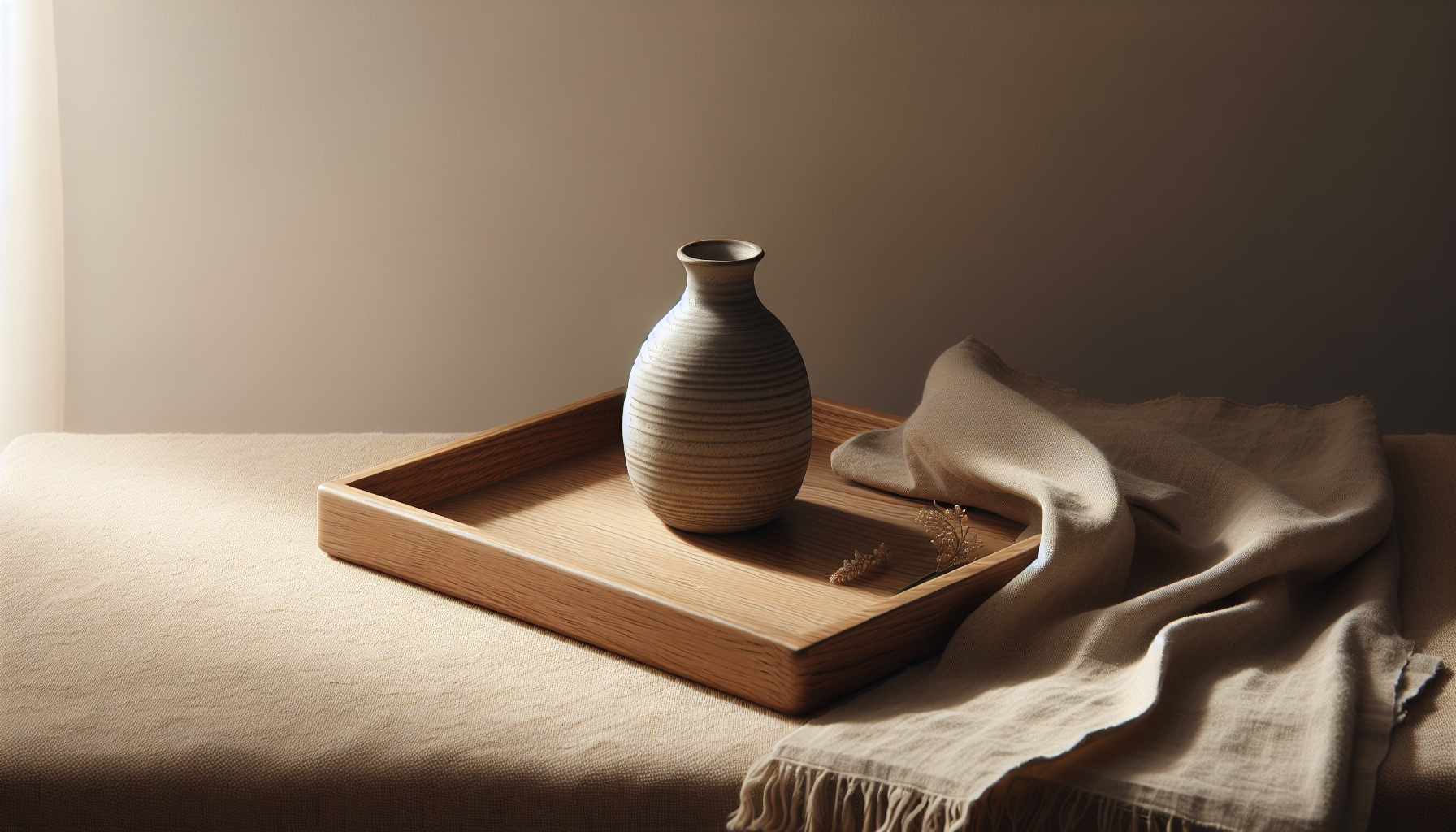
How texture functions like pattern
You should see texture as a kind of silent pattern. For instance, a raw linen cushion with slubs or a hand-thrown ceramic vase with a matte glaze has pattern-like qualities without strong motifs. Using texture enables you to create interest while avoiding visual noise.
Texture also brings warmth and tactility—an essential aspect of Japandi that supports a living space’s comfort and authenticity.
Color and contrast guidelines
Color choices will make or break your patterned interventions. Japandi favors muted, earthy palettes with neutral bases. When adding pattern, keep contrast low and temperature balanced.
- Stick to neutrals: off-white, warm greys, beige, taupe, and soft blacks.
- Add natural accents: muted greens, terracotta, clay, and deep indigo in small amounts.
- Limit high-contrast patterns: avoid black-and-white stripes or bright, saturated prints.
- Use monochrome or analogous variations for calmer effects.
Keep in mind that subtle contrast can be more effective than none at all: a low-contrast stripe or a tone-on-tone geometric can anchor a space without shouting.
Suggested color pairings for patterned elements
- Warm wood + beige/cream textiles: cozy and cohesive.
- Soft grey + charcoal pattern: modern and quiet.
- Muted indigo accent + natural linen: elegant and tactile.
- Terracotta + oiled oak grain: warm and grounded.
These combinations maintain cohesion while letting patterns act as gentle accents.
Scale, proportion, and pattern placement
Scale is crucial. Large, bold patterns will dominate a Japandi room; small, subtle patterns will integrate more seamlessly.
- Large-scale pattern: Use sparingly—one statement rug or a single accent wall in spaces with minimal furniture.
- Medium-scale pattern: Good for upholstery or curtains; adds interest without overwhelming.
- Small-scale pattern: Ideal for cushions, throws, and accessories.
Proportion strategy:
- 1 large pattern + 2 medium patterns + 3 small patterns: This rule helps you layer without chaos.
- Keep patterned surfaces balanced with expanses of plain material to maintain calm.
Where to place patterns in a room
You should be intentional with placement. Consider:
- Floor: Textured or subtly patterned rugs are excellent anchors.
- Seating: Patterned cushions or a single patterned armchair can add personality.
- Walls: Tone-on-tone wallpaper or a framed textile works well for softness.
- Accessories: Ceramics, baskets, and throws provide small doses of pattern.
By distributing patterns thoughtfully, you ensure they enhance rather than compete.
Materials and pattern expression
Materials shape how a pattern reads. Natural and handcrafted materials align best with Japandi’s ethos.
- Wood: Use grain and veneer patterns for warmth—preferably horizontally oriented for calm.
- Linen and cotton: Subtle stripes, slubs, and tonal patterns in these fabrics are ideal.
- Woven fibers: Jute, seagrass, and rattan create geometric textures rather than printed motifs.
- Ceramics and glazes: Organic brushwork and speckled glazes provide handcrafted charm.
- Paper and grasscloth wallpaper: Low-sheen textures with soft patterning work well.
When you choose materials that are honest and tactile, patterns feel like natural extensions of the space’s narrative.
Crafts and handmade details
You should embrace artisanal details—hand-stitched seams, indigo-dyed textile irregularities, or kiln marks on pottery. These “imperfections” add warmth and align with wabi-sabi, offering pattern that’s quietly human.
Patterns by room: practical guidance
Below are room-specific recommendations to help you apply patterns where they’re most effective.
Living room
The living room is where pattern can make the biggest impact if handled carefully.
- Use a low-contrast rug with a subtle geometric or tonal pattern to anchor seating.
- Introduce cushions in varying scales: a small motif, a medium stripe, and a plain textured cushion.
- Select a single patterned accent chair if you want a more graphic touch.
- Keep larger surfaces (sofa, wall) neutral to prevent visual clutter.
Example strategy:
- Rug: medium-scale woven motif (tonal).
- Sofa: plain, textured linen.
- Accents: two patterned cushions (one medium, one small) + one textured throw.
Bedroom
Bedrooms benefit from calming patterns that promote rest.
- Choose bedding with faint stripes or a soft botanical print in muted tones.
- Use a patterned throw at the foot of the bed for layering.
- Consider a woven headboard or wood grain feature for texture without dominant pattern.
Focus on low-contrast patterns that introduce serenity and tactile warmth.
Dining and kitchen
Patterns in dining areas should feel tactile and durable.
- Opt for natural table linens with understated patterning—thin stripes or small checks.
- Use handcrafted ceramic dinnerware with simple brush marks or speckling.
- Consider a runner with a subtle geometric pattern on an oak table to guide focus.
These touches add artisanal character while keeping function and simplicity top of mind.
Bathroom
You can add pattern through textiles and tile selection.
- Use subdued patterned tiles as a backsplash or shower niche accent rather than covering every wall.
- Towels and bathmats in textured weaves provide pattern without busyness.
- Keep fixtures simple and finishes matte to preserve the restful feel.
Subtlety matters more here since bathrooms are typically smaller.
Mixing patterns: rules you should follow
Pattern mixing need not be intimidating. Use simple rules so your combinations feel curated rather than random.
- Limit the palette: Use 2–3 colors across patterns to maintain cohesion.
- Vary scale: Combine large, medium, and small patterns as noted earlier.
- Balance texture with motif: If a textile has a strong motif, pair it with a plain but textured companion.
- Maintain a focal point: Let one patterned item be the star and support it with subtler pieces.
These guidelines will help you layer patterns like a designer while honoring Japandi clarity.
A quick mixing checklist
- Do: Keep contrast low and palette narrow.
- Do: Use at least one plain textural item to rest the eye.
- Don’t: Use more than three strong patterned elements in a small room.
- Don’t: Pair two equally bold patterns next to each other without a neutral buffer.
Practice and testing in your space will build confidence.
Common mistakes and how to fix them
You’ll likely make some missteps when experimenting. Here are common problems and straightforward fixes.
- Problem: Patterns feel chaotic. Fix: Reduce the number of patterns and increase plain, textured surfaces.
- Problem: Pattern overwhelms furniture. Fix: Scale down pattern size or switch to a tone-on-tone version.
- Problem: Colors clash. Fix: Neutralize one pattern by introducing a plain item in a dominant color from the patterned piece.
- Problem: Patterns feel cold or sterile. Fix: Add warm wood tones, woven elements, or a soft, warm accent color.
These fixes keep you moving toward a balanced result.
Lighting and pattern perception
Lighting affects how patterns read. Natural and layered lighting will preserve subtlety and texture.
- Natural light: Reveals texture and soft contrast—great for tone-on-tone patterns.
- Warm ambient lighting: Enhances warmth and softens pattern contrast in the evening.
- Task lighting: Use directed light to highlight textured elements like a woven wall hanging or ceramic grouping.
You should test patterned pieces in the actual room light before committing, ideally at different times of day.
Budget-friendly ways to add subtle pattern
You don’t need expensive designer pieces to incorporate pattern. Affordable options include:
- Second-hand or vintage textiles with tonal patterns.
- Handcrafted ceramics from local makers.
- DIY dyeing or painting: low-contrast stripes or brushes on natural linen.
- Removable wallpaper or fabric panels in small areas.
- Thrifted rugs and re-upholstered cushions using muted, textured fabrics.
With modest investment and careful curation, you can layer pattern into your home without overspending.
Maintenance and longevity
Subtle patterns often wear better over time than bold prints. Still, you should consider durability.
- Choose materials that age gracefully—oils on wood, matte glazes on ceramics, and natural fiber textiles.
- For high-traffic areas, select rugs and upholstery with a tight weave and low sheen.
- Use washable cushion covers and throws to keep patterned textiles fresh.
Design for longevity so your patterned choices stay functional and beautiful.
Examples and mood strategies
You can think about pattern in terms of mood: calming, warm, or quietly sophisticated. Here are simple setups.
- Calming: Muted indigo bedding with a cream tonal stripe + light oak headboard + raw linen cushions.
- Warm: Terracotta textured rug + beige sofa + woven rattan pendant + two small botanical cushions.
- Sophisticated: Charcoal geometric rug (low contrast) + light grey upholstery + ceramic tableware with subtle brush marks.
Each arrangement uses pattern sparingly to achieve a distinct mood without disrupting Japandi restraint.
Practical shopping guide
When you shop for patterns, look for cues that signal suitability for Japandi:
| What to look for | Why it works | Where to use it |
|---|---|---|
| Tonal/low-contrast textiles | Keeps calm while adding interest | Rugs, curtains, bedding |
| Natural fibers (linen, wool, cotton) | Tactile, breathable, understated | Upholstery, throws, cushions |
| Handcrafted ceramics | Imperfect, warm character | Accessories, dinnerware |
| Woven baskets and mats | Functional and textural | Storage, wall accents |
| Wood grain and stone finishes | Pattern that’s inherent to material | Flooring, shelving, accent walls |
Bring fabric swatches and take photos of your room to test color and pattern relationships before buying.
Quick pattern decision flowchart (text version)
You don’t need to create a graphic to make confident choices. Use this simple flow:
- What is the room’s dominant tone? If neutral, continue.
- Do you want a focal point? If yes, select one patterned statement (rug or chair).
- Is the pattern high contrast? If yes, soften it by choosing a tone-on-tone version.
- Can you balance with plain textures? If no, reduce pattern count.
- Test in room light and confirm scale by taping fabric to the furniture or placing rug sample on floor.
Following this will reduce trial-and-error and help you land on balanced outcomes quickly.
Case study: Living room pattern plan
Here’s a practical example you can adapt.
- Base: Light oak floor, cream walls, linen sofa in warm grey.
- Anchor: Medium-scale textured rug in beige with a soft diamond motif (low contrast).
- Seating accents: One armchair in plain natural wool + three cushions: one small indigo tonal pattern, one medium warm-grey stripe, one textured plain cushion.
- Accessories: Ceramic vase with brush marks, woven storage baskets, framed small textile on wall.
This plan keeps patterns restrained, grounded by natural materials and a limited palette.
Final recommendations
You can and should use subtle patterns in Japandi interiors if you apply restraint, prioritize natural materials, and pay attention to scale, placement, and color harmony. Aim for textures that feel handcrafted and patterns that read as quiet rhythm rather than loud statements.
A checklist to end on:
- Keep contrast low and palette tight.
- Favor texture over bold motifs.
- Use one focal patterned element supported by smaller accents.
- Test in the room’s light and at full scale.
- Let natural materials and craftsmanship lead the expression of pattern.
If you stay intentional and patient, patterns will become one of your most powerful tools for creating a warm, lived-in Japandi home that still feels calm and refined.