Have you ever wondered why some interiors immediately calm you the moment you step inside?
Japandi Color Palettes That Encourage Tranquility
Japandi combines the refined simplicity of Japanese design with the warm functionality of Scandinavian style to create spaces that feel calm and balanced. You’ll notice how color plays a central role in shaping that calm, guiding attention and setting a mood that feels intentionally gentle.
Why Japandi feels “peaceful” to most viewers
Most people describe Japandi interiors as peaceful because they pair minimalism with warmth, using color to reduce visual noise and invite rest. When you walk into a Japandi room, colors, materials, and finishes work together so nothing feels out of place or overstimulating.
How color works in Japandi design
Color in Japandi is not just decoration; it’s a tool you use to control atmosphere and perceived space. Subdued, natural hues form the foundation, while carefully chosen accents guide the eye and create subtle focal points.
Core principles of Japandi color selection
Selecting Japandi colors follows a few consistent principles that help you achieve serenity and balance. When you understand these principles, you’ll be better at applying the palette to any room and maintaining the intended mood.
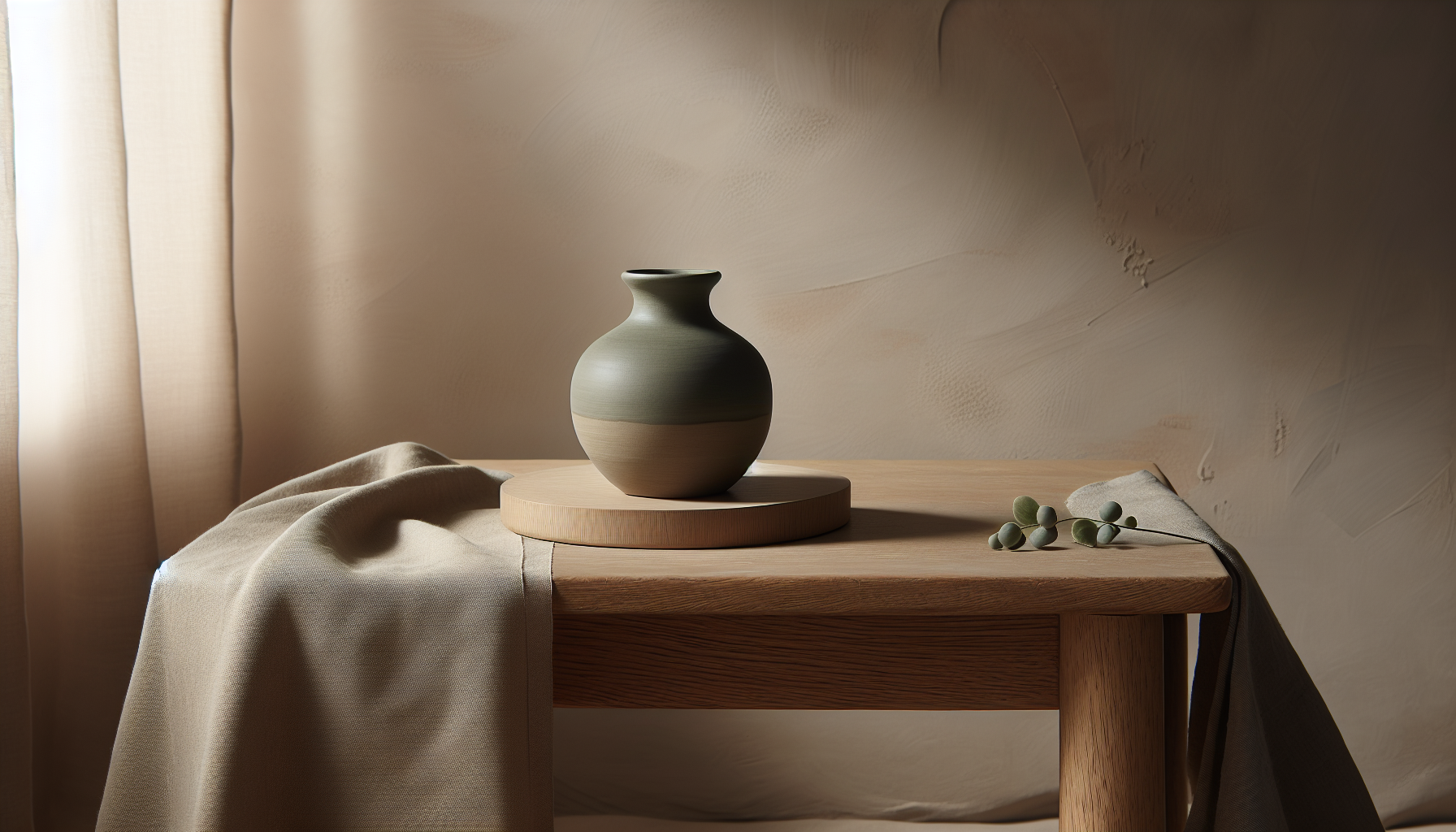
Emphasis on natural, muted tones
You should favor colors that feel rooted in nature—think soft greys, muted greens, beige, off-white, and warm wood tones. These colors mimic landscapes and materials that humans find inherently soothing, which is why they’re staples in Japandi schemes.
Limited, purposeful contrast
Contrasts in Japandi are restrained, used only where they add meaning rather than distract. You’ll see moderate contrast between light walls and slightly darker textiles or furniture, which keeps the environment calm while preserving visual interest.
Warm-cool balance
You’ll want to balance warm and cool tones so spaces don’t feel too sterile or overly cozy. For example, pairing a cool grey wall with warm wood furniture keeps the room grounded and comfortable without making it feel flat.
Texture as a color multiplier
Texture affects how you perceive color—linen, wood grain, and matte plaster make hues appear softer and more complex. When you mix textures, the same color will feel richer and more layered, which helps achieve depth without increasing visual clutter.
Color psychology in Japandi
Understanding the emotional effects of color helps you choose palettes that consistently encourage tranquility. You’ll find certain hues have predictable psychological impacts that align with Japandi values.
Greens and nature-connected calm
Greens evoke growth and calm because they mirror foliage and landscapes. When you use muted green as an accent or a primary wall color, you can promote relaxation and concentration.
Soft neutrals for openness and clarity
Neutrals like warm beige, greige, and off-white create a sense of space and clarity. These tones reduce cognitive load, letting you focus on what matters—comfort, function, and intentional objects—rather than excess visual stimuli.
Subtle blues for serenity
Muted blues provide cool serenity without feeling cold, especially when used sparingly. They’re excellent for bedrooms or reading nooks where you want an atmosphere that supports rest and mental clarity.
Earthy browns for comfort and grounding
Brown tones derived from wood and clay convey stability and warmth. You should include them in furniture or flooring to anchor a room emotionally and visually.
Typical Japandi palette categories
Japandi palettes often fall into categories that highlight different moods: warm minimal, cool minimal, earthy, and muted contrast. Each category gives you a framework for combining colors in a way that feels cohesive.
Warm minimal palettes
Warm minimal palettes center on beige, warm grey, and soft wood tones that make spaces feel inviting and calm. These palettes are ideal if you want a cozy, breathable environment without heavy color.
Cool minimal palettes
Cool minimal palettes use soft greys, muted blues, and cool woods to create clarity and tranquility. You’ll appreciate these palettes in modern apartments or spaces with abundant natural light.
Earthy palettes
Earthy palettes rely on clay, terracotta, olive, and dark wood to produce a grounded, tactile sense of comfort. Use these when you want to combine rustic warmth with elegant minimalism.
Muted contrast palettes
Muted contrast palettes pair desaturated darks—like deep charcoal or faded indigo—with light neutrals to create quiet focal points. These palettes are useful for accent walls, cabinetry, or statement furniture pieces that remain understated.
Practical palette examples with hex codes
Below are several curated Japandi palettes you can use as starting points. Each palette includes suggested uses to help you visualize where the colors might work best in your home.
| Palette name | Color | Hex | Suggested use |
|---|---|---|---|
| Soft Linen | Warm Off-White | #F5F1EA | Primary wall color for light, airy rooms |
| Soft Linen | Greige | #D9D3CB | Trim, ceilings, and built-ins |
| Soft Linen | Ash Wood | #A8907E | Furniture and flooring |
| Soft Linen | Muted Sage | #B2B9A9 | Accent textiles and plants |
| Coastal Calm | Pale Slate Blue | #C7D7DF | Bedroom walls or large textiles |
| Coastal Calm | Cool Grey | #B7BEC4 | Cabinetry and metal finishes |
| Coastal Calm | Driftwood | #9A8576 | Tables, shelving, and frames |
| Coastal Calm | Seafoam Accent | #BFD6CF | Cushions and ceramic pieces |
| Earthen Quiet | Clay | #C08A6B | Feature wall or pottery |
| Earthen Quiet | Soft Taupe | #BFAE9F | Rugs and upholstery |
| Earthen Quiet | Olive Moss | #9BA17D | Accent chair or art matting |
| Earthen Quiet | Dark Walnut | #5C4432 | Solid wood elements |
| Muted Contrast | Chalk White | #EFEFEF | Walls and ceilings |
| Muted Contrast | Charcoal | #3B3B3B | Cabinetry and trim |
| Muted Contrast | Warm Beige | #D7C6B8 | Sofas and linens |
| Muted Contrast | Faded Indigo | #6A6D7A | Accent textiles and vases |
How to use these palettes
You should use the lighter, neutral hues as the base and reserve deeper, more saturated tones for accents. Consider a 60/30/10 rule: 60% primary neutral, 30% secondary warm or cool tone, and 10% accent.
Room-by-room color strategies
Each room has different lighting, function, and furniture, all of which affect how colors will read. Tailor your palette choices to the room’s purpose and natural lighting for the best effect.
Living room strategies
You’ll want the living room to feel welcoming and uncluttered. Select a neutral base, add warm wood tones in furniture, and choose one muted accent color for cushions or artwork to maintain a calm focal point.
Bedroom strategies
Bedrooms benefit from the most subdued tones in Japandi palettes. Soft blues, muted sage, or warm greige are excellent for walls, while textured linens and wooden bedside tables will enhance coziness without adding visual noise.
Kitchen and dining strategies
Kitchens often need contrast for cabinetry or backsplashes. Use a muted, darker tone for lower cabinets and a lighter neutral for walls. Warm wood or stone countertops will maintain balance and softness.
Bathroom strategies
For bathrooms, you can use cool minimal palettes with stone or porcelain finishes. Stick to light neutrals for walls and use mossy or soft blue accents in towels and tiles.
Home office strategies
Your home office should feel focused but calm. Use a soft neutral palette with a muted green or blue accent to boost concentration without overstimulation.
Material pairings that mellow color
Colors behave differently depending on surface finish and material. You should combine color with materials that naturally temper intensity to stay true to Japandi tranquility.
Matte paints and plaster
Matte finishes reduce reflections and make colors appear softer. Use matte or lime plaster for walls to achieve a muted, tactile backdrop that complements wooden elements.
Natural wood and grain
Wood introduces warmth that makes neutrals feel cozy rather than sterile. When you choose walnut, oak, or ash with visible grain, colors gain depth and context.
Linen, wool, and cotton textiles
Natural textiles diffuse color and add subtle variation. Use linen curtains, wool throws, and cotton upholstery to make hues feel layered and approachable.
Stone and ceramic accents
Stone and ceramics contribute muted, inorganic textures that anchor color palettes. Unpolished stone and hand-glazed ceramics give you small, contemplative moments that reinforce calm.
Lighting’s effect on color perception
Light dramatically alters how you perceive color, so you must consider exposure and artificial lighting when selecting palettes. The same paint will look very different in north-facing rooms compared to sun-drenched south-facing rooms.
Daylight vs. artificial light
Natural daylight emphasizes cool undertones in color, especially in north-facing rooms, while warm artificial light can bring out yellow or brown tones. You should test swatches at different times of day to ensure the mood remains calm.
Warm vs. cool bulbs
Choose bulbs that complement your dominant palette—warm bulbs around 2700–3000K are ideal for warm minimal and earthy palettes, while slightly cooler bulbs around 3000–3500K suit cool minimal palettes.
Accent use: when and where to introduce color
Accents are where you can express personality without breaking the overall serenity of a Japandi interior. You should be intentional and measured so accents feel refreshing, not overwhelming.
Art and ceramics as accent carriers
Art, ceramics, and small decorative items are perfect for introducing deeper hues like indigo, clay, or charcoal. These elements allow you to change mood seasonally or as your tastes evolve without repainting.
Textile layering for subtle shifts
You can add personality through cushions, throws, and rugs that layer in complementary tones. Textiles let you introduce pattern and color in a way that remains soft and tactile.
Plants as living accents
Plants add a living green that grounds a space and connects it to nature without overpowering your palette. Choose muted-leaved varieties like pothos, ficus lyrata with pale tones, or olive trees for a restrained look.
Balancing minimalism with personal warmth
You don’t have to sacrifice personality for calm. The key is to be selective with what you keep and how you color it. When you edit thoughtfully, each item carries more emotional weight.
Curate, don’t clutter
Select objects that have function or emotional value rather than filling space with items that only add visual noise. Fewer pieces with stronger presence will make your palette feel intentional and calming.
Introduce heirloom and artisan pieces
A single handcrafted object or an heirloom item can become a central, comforting piece without disturbing the palette. You’ll feel the warmth these pieces add because they contrast silently with simpler forms.
Sample room palettes and applications
Below are practical combinations you can apply to specific rooms, including where to use each color.
| Room | Base (60%) | Secondary (30%) | Accent (10%) | Application notes |
|---|---|---|---|---|
| Living room | Warm Off-White #F5F1EA | Ash Wood #A8907E | Muted Sage #B2B9A9 | Walls, flooring, furniture; cushions and ceramics |
| Bedroom | Pale Slate Blue #C7D7DF | Cool Grey #B7BEC4 | Driftwood #9A8576 | Walls, linens, headboard; bedside tables and frames |
| Kitchen | Chalk White #EFEFEF | Charcoal #3B3B3B | Warm Beige #D7C6B8 | Walls, upper cabinets; lower cabinets and stools |
| Dining | Soft Taupe #BFAE9F | Dark Walnut #5C4432 | Olive Moss #9BA17D | Walls, table; chairs and dinnerware accents |
Implementing these room palettes
Start with the largest surface—walls or flooring—then layer in furniture and textiles before introducing final accents. That way you maintain control over how much tension each color creates.
Paint and finish tips for peaceful results
How you apply paint and finish surfaces influences the end result as much as the color choices themselves. Subtle decisions can make hues appear richer and more calming.
Use pale shades with low LRV for subtlety
Light Reflectance Value (LRV) affects perceived brightness. Choose pale shades with moderate LRV for airy spaces and very low LRV for feature walls that remain understated rather than stark.
Avoid glossy finishes for walls
Gloss increases reflectivity and can make colors feel intense. Opt for eggshell, matte, or flat finishes to keep walls soft and muted.
Coordinate trim with a slightly darker or lighter tone
Painting trim a shade lighter or darker than walls adds definition without breaking the peaceful effect. You’ll get a tailored look that still reads as restrained.
Common mistakes to avoid
Even with calm palettes, some choices can unintentionally create tension. Being aware of these pitfalls will save you time and keep your space aligned with Japandi principles.
Over-saturating with multiple strong accents
Too many bold accents will undercut tranquility. You should limit saturated colors and concentrate them in one or two small areas at most.
Ignoring natural light conditions
Neglecting how sunlight affects color can lead to a room that feels cold or too warm. Always test paint samples in the actual space.
Using inconsistent materials
Clashing finishes like shiny metals with rough natural wood can create visual dissonance. Keep materials in harmony with the palette for consistent mood.
Seasonal and long-term adjustments
You can refresh Japandi palettes in subtle ways as seasons change or your tastes evolve. Small swaps keep the space feeling current without compromising tranquility.
Swap textiles seasonally
Rotate heavier wool throws and darker hues in winter for warmth, then bring in lighter linens and cooler shades in summer to maintain comfort year-round.
Update small accents instead of major changes
Changing cushions, ceramics, and art is an economical way to refresh the palette. You’ll preserve the base layers while renewing visual interest.
Sourcing materials and sustainable choices
Japandi values craftsmanship and natural materials, so choosing sustainable options will support both aesthetic and ethical goals. You should prefer quality over quantity when furnishing.
Look for certified wood and natural fibers
Select FSC-certified wood, reclaimed materials, and natural-fiber textiles when possible. These choices support durability and age beautifully, complementing your color selections as finishes mellow over time.
Support local artisans
Handmade ceramics, textiles, and furniture often use local, natural materials and unique glazes that fit Japandi aesthetics. You’ll get pieces with subtle imperfections that make a room feel authentic.
Quick palette checklist before you start
Before painting or purchasing, run through this checklist to ensure your choices will promote tranquility.
- Test paint samples at different times of day.
- Choose one primary neutral, one secondary tone, and one small accent.
- Coordinate finishes and textures to soften color.
- Introduce living plants to connect the palette to nature.
- Keep clutter minimal and curated.
Why the checklist matters
Following the checklist helps you avoid reactive decisions and stay intentional about color balance and material selection. When you slow down and plan, your results will consistently feel peaceful and purposeful.
FAQs about Japandi color palettes
You likely have practical questions about execution, and answers can save time and mistakes. Below are common queries with straightforward guidance.
Can I use white in Japandi interiors?
Yes—white works well as a neutral base, but you’ll get the most serene results with warm or slightly textured whites rather than stark, pure white. Pair it with warm wood and soft textiles.
Is pattern allowed in Japandi?
Pattern is allowed when it’s subtle and textural rather than bold. You’ll find that restrained, small-scale patterns in muted tones enhance depth without creating clutter.
How much black can I use?
Black should be used sparingly, mainly for slim contrasts such as cabinet handles, picture frames, or table legs. Too much black will create harshness that undermines tranquility.
Final tips to create a tranquil Japandi home
The most calming Japandi spaces are intentionally edited, well-lit, and rich in natural materials. You should aim for balance, letting color support form and texture rather than dominate it.
- Start with a neutral canvas and build slowly.
- Prioritize tactile materials that soften color perception.
- Test, observe, and adjust according to light and function.
- Keep personal items meaningful and limited to maintain serenity.
Closing thought
When you use Japandi color palettes thoughtfully, your home becomes a place where color supports calm, materials comfort, and space feels intentionally simple. If you follow the principles and techniques above, you’ll create environments that consistently encourage tranquility without sacrificing character.