What draws you to the quiet, restrained beauty of Japandi color palettes?
Calm Color Palettes Typical of Japandi Style
Japandi fuses Japanese minimalism with Scandinavian warmth, creating spaces that feel both serene and inviting. You’ll find that the color choices are central to that sensation, guiding every design decision from walls to textiles.
What Japandi Is and Why Color Matters
Japandi blends the clean lines and simplicity of Japanese design with the functional comfort and coziness of Scandinavian interiors. Color in Japandi isn’t decorative for decoration’s sake — it’s a tool you use to shape mood, emphasize form, and create a consistent, tranquil environment. The right palette helps you achieve balance between restraint and comfort.
Why people describe Japandi as “calm”
People call Japandi “calm” because its colors reduce visual noise and emphasize natural rhythm. You’ll notice subdued tones, understated contrasts, and lots of soft, warm neutrals that let materials and shapes breathe. The result is a space that feels orderly yet lived-in, where your attention can rest rather than be constantly stimulated.
Core principles behind Japandi color choices
Japandi color selections follow a few consistent principles: restraint, natural inspiration, harmonious contrasts, and an emphasis on texture and material. These principles guide decisions so your palette supports function and comfort as much as aesthetics. When you apply these ideas, your spaces will feel purposeful and timeless.
Restraint and simplicity
You’ll want to limit the number of dominant colors to avoid visual clutter. A restrained palette often includes one or two primary neutrals, a couple of supporting tones, and a single accent. This simplicity creates calm and prevents distraction.
Natural inspiration
Japandi palettes take cues from landscapes, wood grains, and traditional crafts. You’ll lean toward colors that feel rooted in nature — soft stone grays, muted greens, warm beige, and clay-like terracotta. These evoke familiarity and balance.
Harmonious contrast
Contrast in Japandi is subtle and functional. Instead of stark black-and-white juxtapositions, you’ll use gentle variations in tone and temperature to create depth. This approach keeps the mood serene while still allowing the eye to move through the space.
Texture-first approach
Color in Japandi often partners with texture: raw wood, woven textiles, matte plasters, and linen. You’ll rely on textural contrast as much as color contrast to add interest, which helps maintain calm without appearing flat.
Color theory basics for Japandi
Understanding a few color theory basics will help you create effective Japandi palettes. You’ll want to focus on hue (what color it is), value (how light or dark it is), and saturation (how intense it is). Japandi favors low to medium saturation and balanced values.
Hue and temperature
Warm and cool hues can both work in Japandi, but you’ll usually choose a dominant temperature to keep the space cohesive. Warm palettes use beige, terracotta, and honeyed woods, while cool palettes lean on soft grays, muted greens, and ash woods.
Value and contrast
Low-to-moderate contrast is typical, so you’ll choose colors with related values to ensure a calm composition. Using one darker anchor (like a deep charcoal or walnut) and lighter supporting tones helps create depth without raising visual tension.
Saturation and restraint
You’ll want to desaturate vivid colors; muted tones feel more refined and restful. If you want color pops, choose muted, earthy versions rather than saturated primaries.
Typical Japandi color families
Below are common categories you’ll see in Japandi palettes, each with a couple of sentences to guide your choices.
Neutral base colors
Neutrals form the backbone of the Japandi aesthetic: off-whites, warm grays, taupes, and soft beige. You’ll use these on walls and large surfaces to create a calm, consistent backdrop.
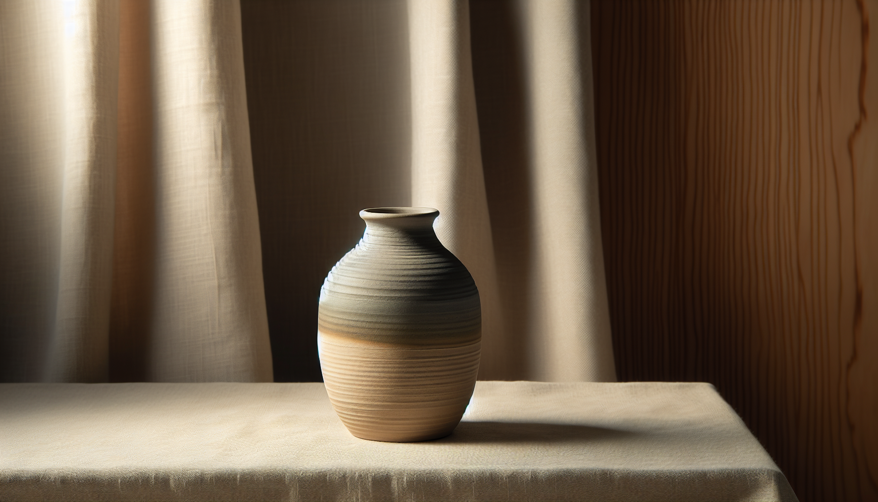
Soft earthy tones
Earthy tones like clay, muted terracotta, and sand provide warmth and a tactile connection to nature. You’ll often see them in ceramics, upholstery, and accent walls.
Muted greens and blues
Desaturated, gray-leaning greens and blues suggest moss, sea, and sky without overpowering other elements. You’ll use them to bring a hint of nature’s color while keeping the mood subdued.
Deep accents and anchors
Charcoal, deep green-gray, indigo, and walnut tones serve as anchors. You’ll use these sparingly for focal furniture, window frames, or cabinetry to ground the palette.
Soft pastel accents (used sparingly)
Muted pastels — think dusty rose, pale peach, and chalky sage — can appear as accent textiles or art. You’ll use them subtly so they enhance warmth without breaking calm.
Palette examples (with HEX codes and pairings)
This table gives concrete palette ideas you can test. Each row includes a dominant neutral, supporting tones, and an accent to guide you when selecting paint, textiles, or furnishings.
| Palette name | Dominant neutral (HEX) | Supporting tones (HEX) | Accent (HEX) | Mood & use |
|---|---|---|---|---|
| Soft Sand & Ash | #EFE8E0 (soft warm white) | #C9BDB3 (light taupe), #8D8A86 (warm gray) | #6B4F3B (walnut brown) | Calm, very versatile for living rooms and bedrooms |
| Moss & Clay | #E7E9E5 (light gray-green) | #9AA49A (muted moss), #CBB6AA (clay) | #5A6A5A (deep green-gray) | Earthy, cozy; great with wood and ceramics |
| Nordic Calm | #F6F5F3 (pale neutral) | #D7D4CF (soft stone), #9EA6A4 (ash blue) | #3F3F3E (charcoal) | Light, airy, works for small spaces or open plans |
| Warm Terracotta | #F1EDE9 (cream) | #CFA79B (muted terracotta), #B8A090 (warm beige) | #6A4630 (dark terracotta brown) | Cozy, tactile, excellent for kitchens and dining rooms |
| Muted Ocean | #EDF1F2 (pale blue-gray) | #B7C7CA (desaturated teal), #A9B7B8 (soft slate) | #3B5A5C (deep teal) | Serene, peaceful — ideal for bathrooms or bedrooms |
| Dusty Rose & Ash | #F5F2F1 (pale neutral) | #D8B6B0 (dusty rose), #BFB6AF (soft greige) | #5E4B47 (rich wood) | Warm, refined, works for accent textiles and small furnishings |
How to apply palettes by room
Color works differently across rooms due to lighting, scale, and function. Use these suggestions to tailor Japandi palettes to specific spaces in your home. You’ll learn which tones suit each purpose best.
Living room
The living room benefits from a calm neutral base with warm wood and one muted accent. You’ll want your walls and large upholstered pieces in light neutrals, medium-toned wood furniture, and textured throws or cushions in desaturated greens or clay.
Bedroom
For a restful bedroom, choose soft neutrals and low-contrast bedding. You’ll favor warmer or neutral tones to promote relaxation: sandy beiges, soft sage, or very pale blues. Keep decorative accents minimal and tactile.
Kitchen and dining
Kitchens can show slightly bolder, grounded choices: two-tone cabinets with pale upper fronts and deep-gray or walnut lower cabinets. You’ll balance functional surfaces with clay or terracotta accessories to add warmth.
Bathroom
Bathrooms work well with cool, muted blues and grays paired with warm wooden elements and stone textures. You’ll aim for a spa-like atmosphere using subtle color and matte surfaces.
Home office
For a calm, focused office, use low-saturation greens or blues with clean neutrals. You’ll pick an anchor color for storage or shelving and keep the workspace clutter-free to maximize the calming effect.
Materials and finishes that enhance Japandi colors
Your material choices will amplify the color palette and add depth without introducing competing hues. You’ll look for natural materials with simple finishes.
Wood tones
Light oak, walnut, and ash are staples. You’ll prefer natural or oiled finishes that showcase grain rather than glossy stains. Wood brings warmth that complements neutral palettes.
Natural fibers
Linen, wool, cotton, and jute add texture and softness. You’ll choose textiles in muted shades or natural undyed tones to maintain a calm look.
Ceramics and matte surfaces
Handmade ceramics in muted glazes and matte plasters for walls or countertops help the palette feel crafted and organic. You’ll avoid high-gloss finishes that can make colors feel harsh.
Stone and concrete
Softly honed stone, terrazzo with subdued aggregates, and matte concrete surfaces pair well with Japandi colors. You’ll use these sparingly to anchor spaces like sinks or flooring.
Layering colors: walls, furniture, textiles, and accents
Layering colors helps you build depth while keeping a calm aesthetic. You’ll prioritize large surface neutrality and add personality through mid- and small-scale elements.
Walls and ceilings
Start with a neutral wall color to unify the room. You’ll choose a slightly warmer or cooler neutral based on your preference and natural light. Ceilings usually stay a touch lighter than walls to maintain openness.
Furniture and built-ins
Select furniture in natural wood or upholstery in muted colors. You’ll use darker wood or deep-gray pieces as anchors while keeping sofas and chairs in softer tones.
Textiles and rugs
Use woven rugs and textured throws to introduce secondary tones and gentle patterns. You’ll choose textiles that complement rather than clash with your main palette.
Accessories and art
Keep accessories sculptural and sparse. You’ll use ceramics, wooden objects, and simple framed artwork with muted palettes to add interest without overwhelming the space.
Choosing accent colors and how to use them sparingly
Accents should create focal points and add personality but must not disrupt the calm. You’ll use them in measured quantities: a single armchair, a shelf of ceramics, a patterned cushion, or a painted cabinet.
Accent placement strategies
Place accents where the eye naturally rests: near seating, mantels, or console tables. You’ll avoid scattering bright items across the room to keep balance.
Complementary and analogous accents
Use analogous accents (colors adjacent on the color wheel) for harmonious warmth or complementary accents (soft versions of opposite colors) for subtle tension. You’ll prefer low saturation to keep everything soothing.
Lighting’s impact on Japandi colors
Light changes how colors read, so you’ll tune your palette to the room’s natural and artificial lighting. Warm light emphasizes warm tones; cool light will mute them differently.
Natural light considerations
Rooms with north-facing light tend to look cooler, so you’ll choose slightly warmer neutrals to compensate. South- and west-facing rooms can handle cooler grays and blues, but you’ll still keep things muted.
Artificial light choices
Use warm LED temperatures (2700–3000K) in living areas to maintain coziness. You’ll use layered lighting — ambient, task, accent — to reveal textures and soften colors.
Paint finishes and texture choices
Finish affects perception of color and mood. You’ll pick finishes that minimize glare and highlight texture for a more natural look.
Matte and eggshell finishes
Matte and eggshell paints are popular in Japandi interiors because they reduce reflections and support a handcrafted vibe. You’ll use matte on walls and eggshell on wood trim for subtle contrast.
Avoiding high gloss
High-gloss finishes can make colors feel artificial. You’ll reserve glossier finishes for surfaces that need durability (kitchen cabinets, bathroom trim) but choose satin rather than mirror-like gloss.
Lighting a palette with natural materials: suggestions by material
This table helps you match material to palette for a cohesive effect.
| Material | Typical use | Best palette matches | Notes |
|---|---|---|---|
| Light oak | Flooring, shelving, furniture | Soft Sand & Ash, Nordic Calm | Brings warmth and pairs with cool grays for balance |
| Walnut | Dining tables, accent furniture | Warm Terracotta, Dusty Rose & Ash | Adds depth and anchors muted palettes |
| Linen | Curtains, cushions, bedding | Moss & Clay, Muted Ocean | Natural dye variations fit Japandi’s crafted feel |
| Stone (limestone, honed marble) | Countertops, bathrooms | Nordic Calm, Muted Ocean | Smooth, matte finishes reflect subtle light |
| Terracotta | Planters, tiles, ceramics | Warm Terracotta, Moss & Clay | Use as small-scale warmth injections |
| Concrete (matte) | Sinks, floors | Muted Ocean, Soft Sand & Ash | Industrial texture balanced by warm wood |
Common mistakes and how to avoid them
Even with a restrained palette, mistakes can occur. You’ll want to watch for a few traps and correct them early.
Using too many accents
Too many accent colors break the calm. You’ll limit accents to one or two desaturated colors and repeat them throughout the room for coherence.
Over-matching wood and neutrals
Avoid matching everything to the same undertone; too much uniformity can appear flat. You’ll mix warm and cool neutrals in small doses to add depth.
Forgetting texture
A monochrome palette without texture feels sterile. You’ll layer woven textiles, matte ceramics, and raw wood to bring life to subdued colors.
Ignoring scale
Large dark accents can dominate a small room. You’ll scale contrasts to the room size — lighter overall tones in small spaces, stronger anchors in large rooms.
Practical step-by-step: create your own Japandi palette
This process helps you make a confident palette decision for any room.
- Assess natural light and room size. You’ll note direction of windows and overall brightness.
- Choose a dominant neutral. Pick a warm or cool neutral based on light.
- Select one or two supporting tones. These should be desaturated and natural.
- Choose one deep anchor color. Use this sparingly on large furniture or cabinetry.
- Add a muted accent. A small pop in textiles or ceramics adds personality.
- Test samples on multiple walls and with materials. You’ll observe how color shifts through the day.
- Balance textures and finishes. Swap glossy surfaces for matte or natural materials.
- Finalize and distribute colors among walls, furniture, and accessories.
Sample mood boards (descriptions for specific ambiances)
You’ll find examples that show how palettes translate into atmosphere. These verbal mood boards help you visualize combinations before committing.
Tranquil bedroom mood
Pale warm gray walls, a linen duvet in soft sage, a walnut bedside table, and a handwoven jute rug. You’ll keep artwork minimal — a single neutral-toned print — and use layered lighting for soft evenings.
Warm, social living room mood
Cream walls, a low-profile oak sofa frame with taupe upholstery, terracotta ceramics on a floating shelf, and a deep charcoal accent armchair. You’ll add textured throws and a large woven rug to anchor the seating area.
Light, focused workspace mood
Pale stone-gray walls, ash wood desk, dusty blue storage cabinets, and muted green shelving accessories. You’ll orient the desk to natural light and add a soft-tone task lamp to reduce eye strain.
Seasonal tweaks while keeping Japandi calm
You might want small seasonal refreshes without upsetting the base palette. You’ll change textiles and accessories rather than big pieces.
Spring and summer
Introduce light linen throws in pale blue or sage and swap heavier rugs for flatweave variants. You’ll add potted plants for fresh greenery.
Fall and winter
Bring in warmer throws in muted terracotta or dusty rose and switch to wool rugs or thicker cushions. You’ll use candlelight and textured ceramics to increase cozy ambiance.
Shopping and sourcing tips
Finding the right items supports your palette decisions. You’ll search for natural materials, handcrafted objects, and neutral textiles.
- Look for locally made ceramics and textiles with matte glazes or natural dye variations.
- Prefer solid wood furniture with visible grain over heavily lacquered pieces.
- Test paint and fabric samples at home to see colors in your light.
- Avoid mass-produced bright prints; opt for subtle patterns or tone-on-tone weaves.
Final checklist before committing to a palette
Before you paint or buy, run through this checklist to confirm your choices.
- Have you tested paint samples on multiple walls and at different times of day?
- Does the palette feel cohesive with the fixed elements (flooring, built-ins)?
- Are your accents muted and used sparingly?
- Have you balanced warm and cool undertones where necessary?
- Do textures and finishes complement the colors rather than fight them?
Summary and next steps
You’ve seen how Japandi uses restrained, nature-inspired colors to create calm, functional, and inviting interiors. By prioritizing desaturated hues, natural materials, subtle contrast, and layered texture, you’ll make spaces that feel balanced and timeless. Start small: test a neutral wall, add a muted accent textile, and let the room’s materials guide the rest of your decisions.
If you’d like, you can tell me the room you’re planning and the lighting conditions, and I’ll suggest a tailored Japandi palette with specific paint codes and material pairings you can use.